Following on from this post last week, it’s now time to share my Dulux NZ paint selection series for our downstairs living room update. As mentioned, my wish was for a warm beige hue, with new flooring selected around this palette. Choosing the right paint colour began with the recently re-launched Dulux Colours of New Zealand Fandeck. A fantastic tool, the fandeck showcases over 1,000 contemporary shades from the iconic collection, all of which are inspired by the natural beauty of NZ. With a focus on New Zealand’s much loved outdoors, this concept really resonates with me because I draw so much styling inspiration from nature. With connections to memorable places throughout NZ, I love the process of browsing through colours and seeing links to the beautiful NZ locations that inspired them.
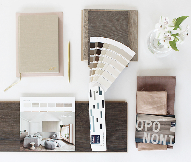
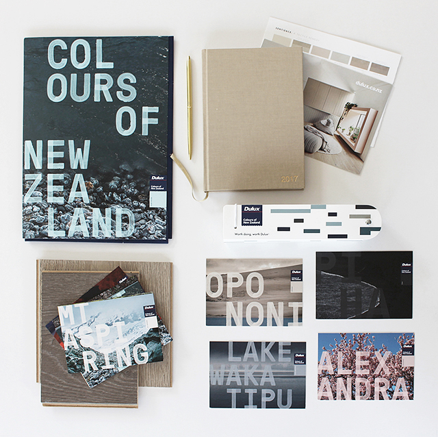
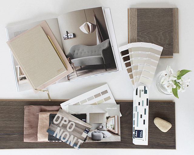
Referring to a few interior images I had bookmarked both in print and online, along with my favourite Sentience colour palette from this year’s Dulux Colour Forecast, the Fandeck was a great starting point. Having every colour at my fingertips, I could work through a process of elimination, finally deciding on a shortlist of colours across a palette of beautiful beiges and greiges. Using the Dulux Colour Swatch Service which I wrote about last year, the colours soon arrived in the post as large swatches, ready to test out in our space.
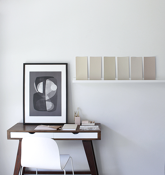
Pretty paint swatches all in a row, my shortlist included from L-R: Calm Peak, Kauri Cliffs Double, Dingleburn, Kinleith Double, Sandrock Bluff Double and King Country.
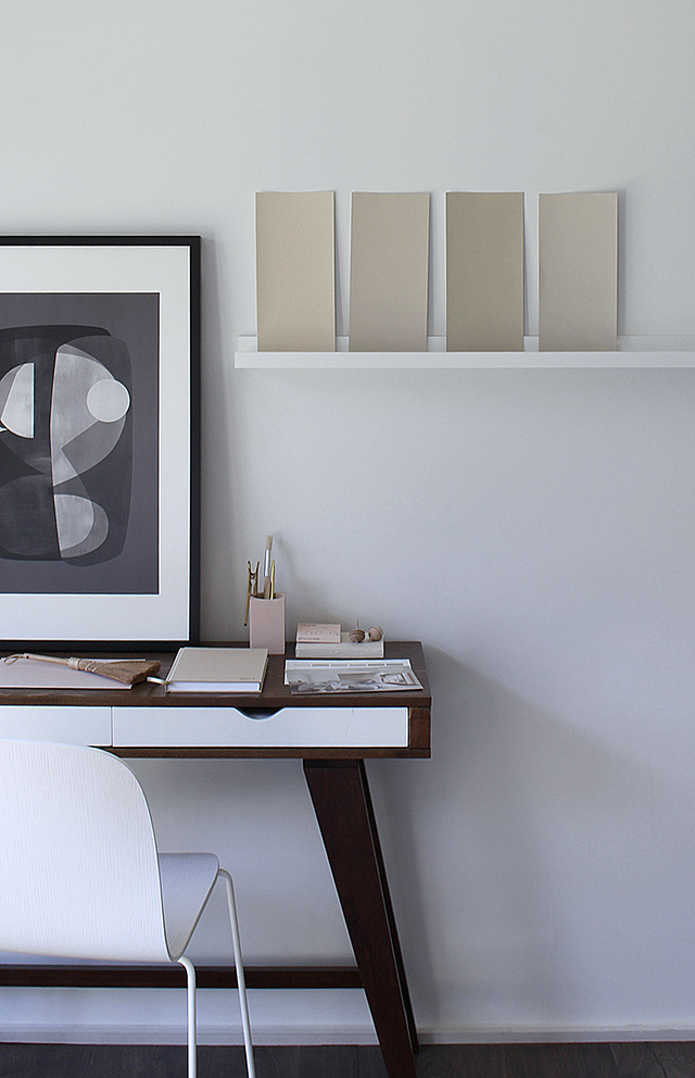
Knowing how different the light is downstairs in comparison to upstairs where I do the majority of my styling and photography, I really wanted to get an accurate feel for how the colours would look. I put the swatches up around the room and studied them at different times. Seeing how the colours looked as the light changes throughout the day proved invaluable. Initially leaning towards Sandrock Bluff Double, I found that the light combined with the surrounding white paint in the adjoining hallway and ceiling gave the colour a yellow undertone. Wanting to achieve a warmer grey/pink undertone, I was able to find the perfect colour.
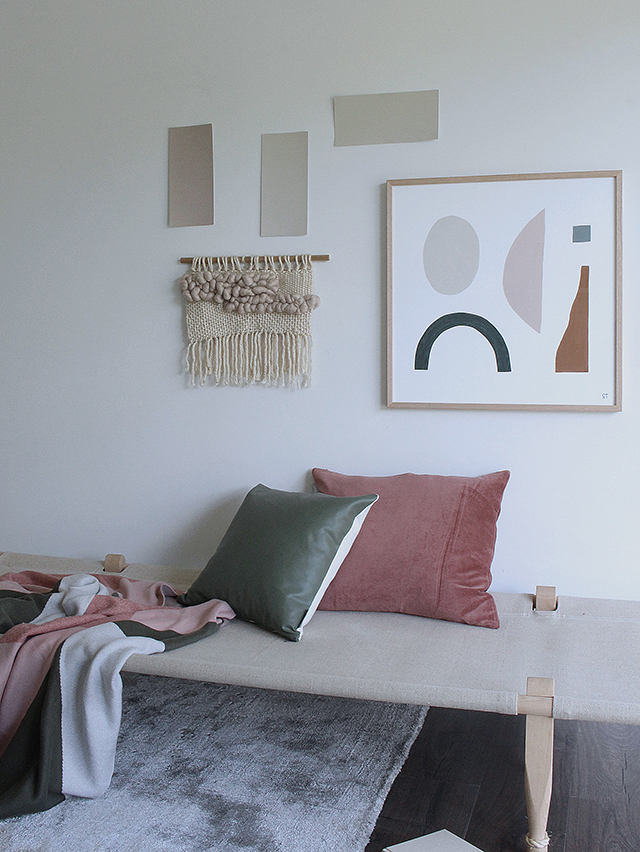
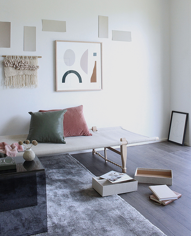
Styling & photography by Michelle Halford for TDC
The paint I chose is inspired by a truly stunning location in NZ. Painted yesterday, it certainly lives up to its name and looks beautiful. I can’t wait to share it with you soon!
This post was brought to you in collaboration with Dulux NZ. I only work with products I love and all opinions are my own. For more information please visit my About Page.