Every room in this apartment (Styled by Josefsson Ljung, photographed by Alen Codric for Nya Kvadrat) earns its keep, layering character and calm in equal measure. Spread across two levels, the home balances historic architectural details with a considered, earthy palette.
One Floor Does a Lot of Work in This Hardworking Kitchen and Dining Space
The ground floor bears the weight of daily life with ease, housing a galley kitchen, a dining area, and two distinct seating areas in a single open-plan space. Dark grey shaker cabinets anchor the space visually, giving it a cohesive and grounded identity. The layout is considered rather than compressed, with each area reading as its own room while still contributing to a unified whole.

The cabinetry earns close attention here: dark grey shakers paired with white marble countertops, a white tile backsplash, and warm brass hardware. Natural wood open shelving on the wall softens the contrast and introduces an earthy, tactile quality.

A coffee corner tucked beside the window brings a quietly luxurious note to the kitchen. Sunlit and inviting, it carves out a moment of pause within an otherwise industrious space.

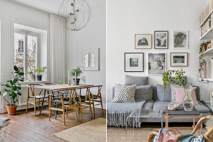
The dining table sits in warm wood tones, paired with classic Danish chairs that echo the same natural grain. Nothing here competes for attention. The pairing is straightforward and honest, which is exactly what makes it work so well.

An antique glass cabinet stands beside the dining table, painted to match the light grey walls so that it reads as both furniture and architecture. The effect is layered quietly: the piece has age and presence, but it does not interrupt the room.

Tucked into a niche in front of the window, a small sofa area transforms what could have been an awkward corner into a cozy and inviting seat. Natural light reaches it generously, making it the kind of spot that fills up first. The proportions feel exactly right for the space it occupies.

The grey sofa grounds the niche seating area while art prints on the wall introduce color without disrupting the overall calm. Neutral wood tones throughout keep the palette earthy and consistent.

The second niche holds a historic fireplace with tactile blue ceramic details that give it a sculptural quality. A nearby light-blue wall shelf echoes that same tone, creating a quiet visual thread across the room.

The Kitchen Extends Its Palette All the Way to the Front Door
At the far end of the kitchen, the hallway continues the built-in cabinetry language while shifting to a different color. The transition is subtle enough to feel considered rather than jarring. It draws the eye forward and gives the apartment a sense of flow from one end to the other.

The Landing Becomes a Calm and Considered Living Room
The landing on the second level has been given over entirely to a living area, with a grey sofa and bespoke cabinets built neatly beneath the sloped ceiling. Every centimeter is used without the space feeling crowded. The result is a room that feels cozy and intentional in equal measure.

Layered neutral textiles across the sofa and surrounding surfaces bring a calm, textured softness to the landing. The tones are earthy and restrained, letting the architecture do the heavier work. Tranquil is the word that comes to mind, and the styling earns it without any effort.

Sloped Ceilings and Smart Choices Define This Restful Bedroom
Beneath the sloped roof, a small double bed fits with more ease than the proportions might suggest. A single wall lamp and one nightstand keep the layout open and uncluttered.

Between two exposed beams, a niche has been fitted with a simple clothing rail, turning an architectural gap into practical storage. The natural wood of the beams frames it in a way that feels warm and considered.

Deep Green Walls and a Built-In Wardrobe Make the Guest Bedroom Memorable
The guest bedroom makes its mark with deep, earthy green walls and a built-in wardrobe painted to match, wrapping the bed in a cocoon of color. The monochromatic approach is bold but grounded, and the overall effect feels inviting rather than overwhelming.

High Contrast and Dark Drama Define This Striking Bathroom
White tiles with black grout cover the lower half of the bathroom walls, while the upper section is painted a deep black to heighten the contrast. The division feels architectural rather than decorative, giving the small room a graphic strength.

A dark grey vanity topped with marble sits comfortably within the high-contrast scheme, its tactile surface adding warmth to an otherwise sharp palette. The marble countertop bridges the dark and light tones without softening the overall mood.

The post Attic apartment with a dark grey galley kitchen and custom built-ins appeared first on COCO LAPINE DESIGN.