In this special bonus “extra credit” lesson we will discuss color proportions and intensity. It’s one thing to be able to choose a beautiful color story, but did you know that the distribution and quantities of each color along with the contrast between them can also play a major role in a color scheme? Composition is one of the key elements to creating a pleasing visual experience.
Using the guidelines from my second lesson, you can easily select hues to suit one of the classic color schemes, but there is so much beyond that. Playing with tints, tones, and shades, you can make tweaks and adjustments to those color schemes to create entirely different moods. Contrast is one of the main ways to do so. It can be used to soothe or energize, to ground certain elements, or to highlight or draw attention to key elements of a design.
When it comes to contrast, there are several different types:
Contrasts of chroma refers to combinations of hues with the same level of chromatic intensity. This type of contrast produces a vibrant, harmonious effect.
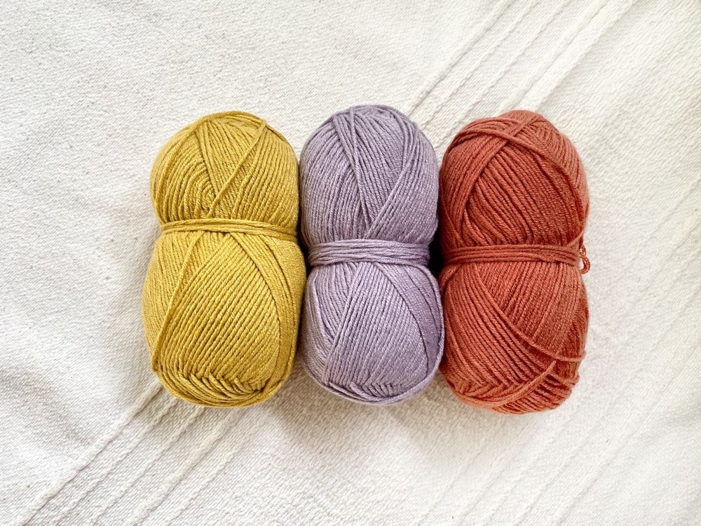
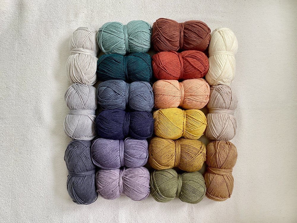
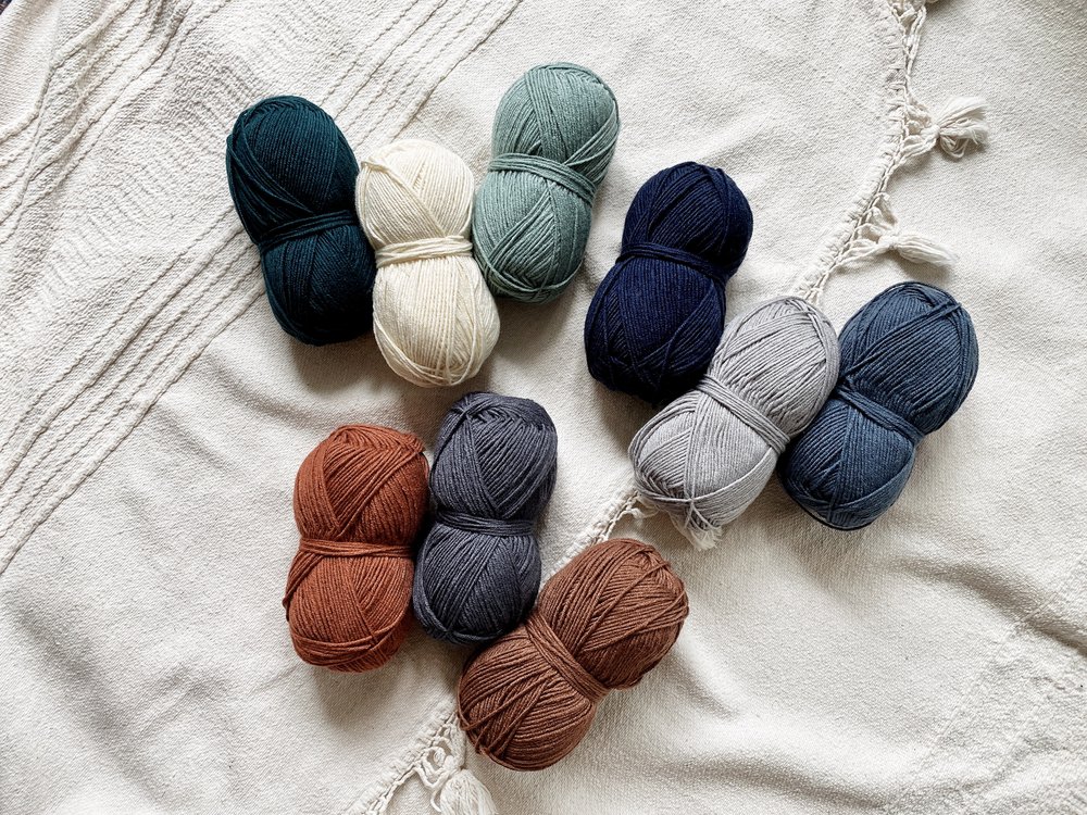
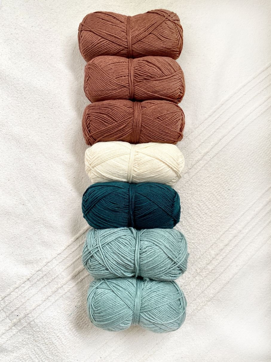
Contrasts of chroma: Bee Pollen, Provence, and Canyon
Contrasts of saturation or value refers to the combinations of tints, tones, and shades within the color scheme. This is similar to a monochromatic color scheme. These contrasts can have a great effect on the mood of a design. Strong saturation or value contrasts can energize and provide structure, while designs with little variation offer a more soothing or moody appearance. Contrasts of saturation or value can also be used simultaneously with the following contrasts.
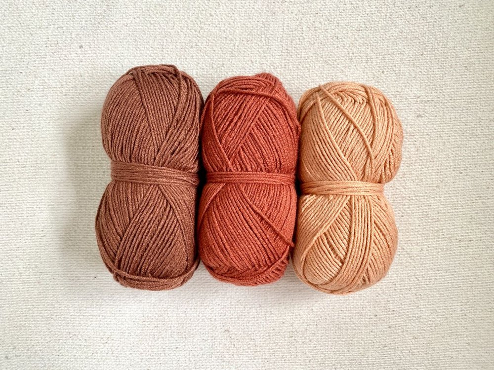
Contrasts of saturation or value: Raisin, Canyon, and Himalayan Salt
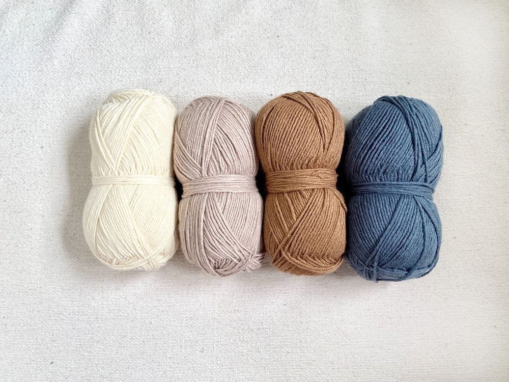
Contrasts of neutral and chroma refers to combinations of predominantly neutral color stories with accents of saturated hues, or vice versa.
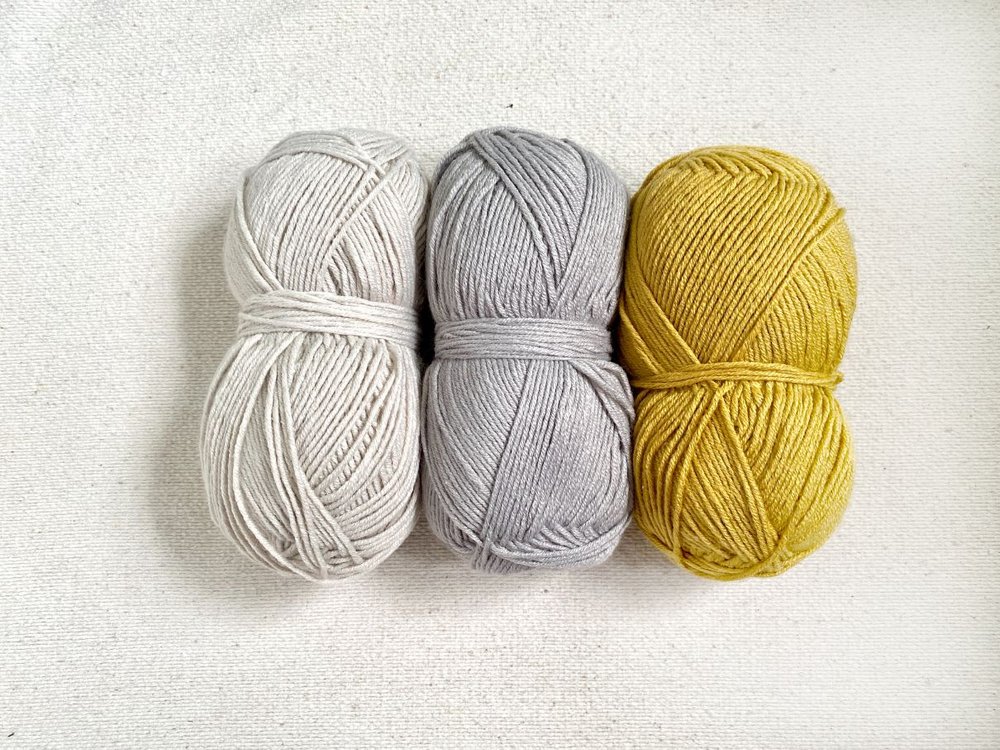
Contrasts of neutral and chroma: Moonbeam, Satellite, and Bee Pollen
Contrasts of temperature refer to combinations that utilize both warm and cool colors, commonly of complementary colors.
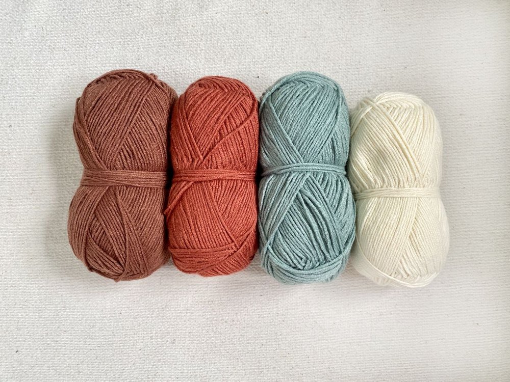
Contrasts of temperature: Raisin, Canyon, Tourmaline, and Ivory
Contrasts of temperature (also contrasts of neutral and chroma): Ivory, Bone, Nutmeg, and Stonewash
Contrasts of quantity refers to the amount of each color within the color scheme.
After colors are selected for a project, whether it be a hand knit or crochet item, home decor, or a graphic design layout, the way you arrange those colors can drastically alter the overall feel. One of the most basic guidelines when it comes to color composition is the 60/30/10 rule, which states that in any design, 60% should be a dominant color, 30% should be a secondary color, and 10% should be an accent color. Consider a room with white walls and couches (60%), beige rugs and chairs (30%), and a couple of bright yellow throw pillows (10%) – it feels balanced, soothing, intentional, and visually pleasing.
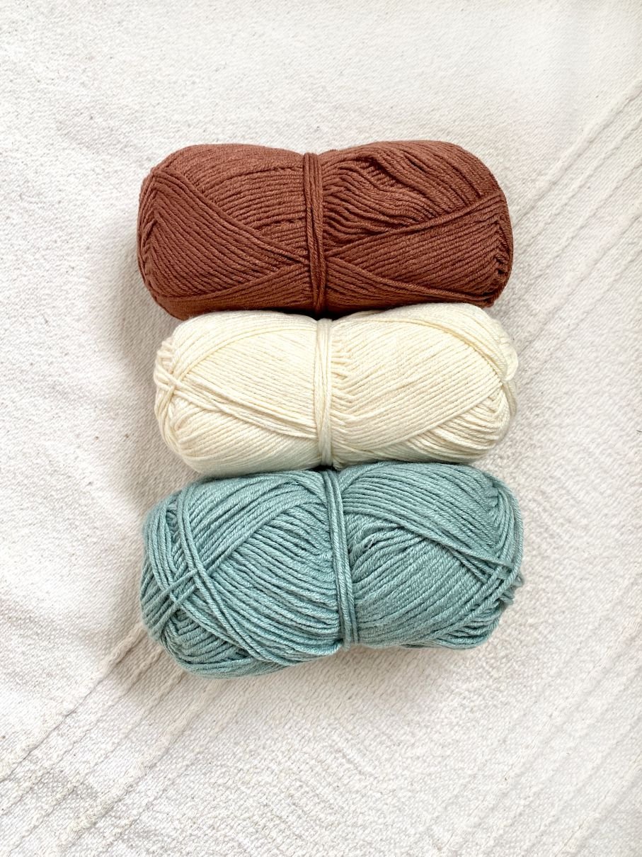
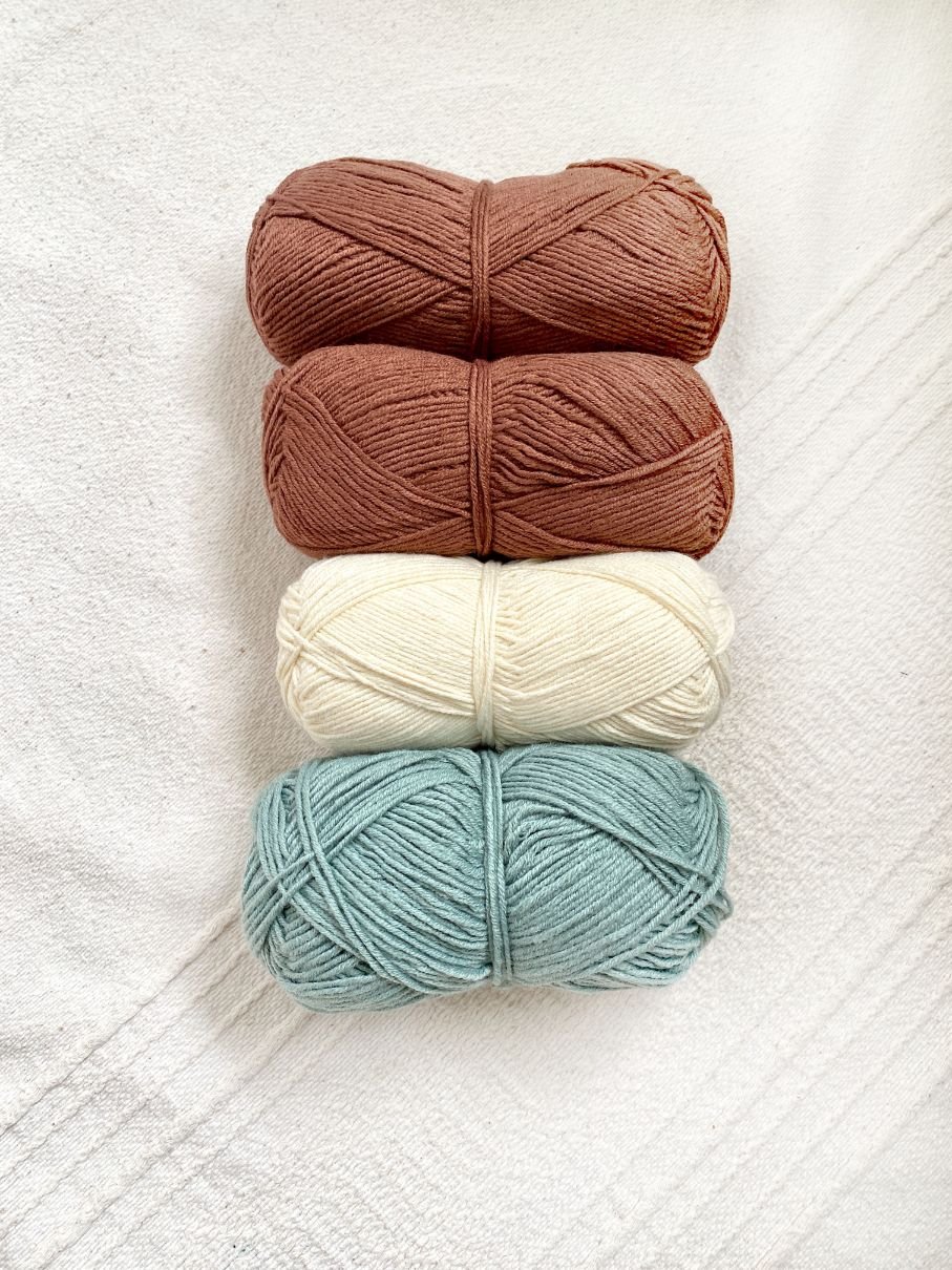
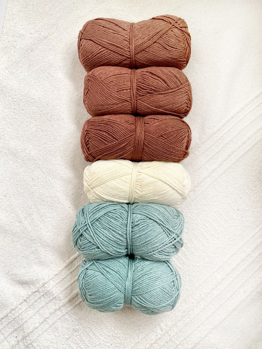
Watch how the balance of this color scheme with Raisin, Ivory, and Tourmaline changes as the quantities of color shift.
33/33/33
50/25/25
60/30/10
Typically in a design, the dominant color will be the background, base, or grounding color. The secondary color should be something that supports the dominant color rather than competes with it, and the accent color should be something with higher contrast to the other two so that it draws visual interest. Keep in mind that the accent color can either be more bold or more subtle than the dominant and secondary colors, as long as there is contrast – each option will just have a different feel. One variation of the 60/30/10 rule is to add in a fourth color, either another secondary color or another accent color. In this example, I added another accent color (Peacock) to provide even more contrast.
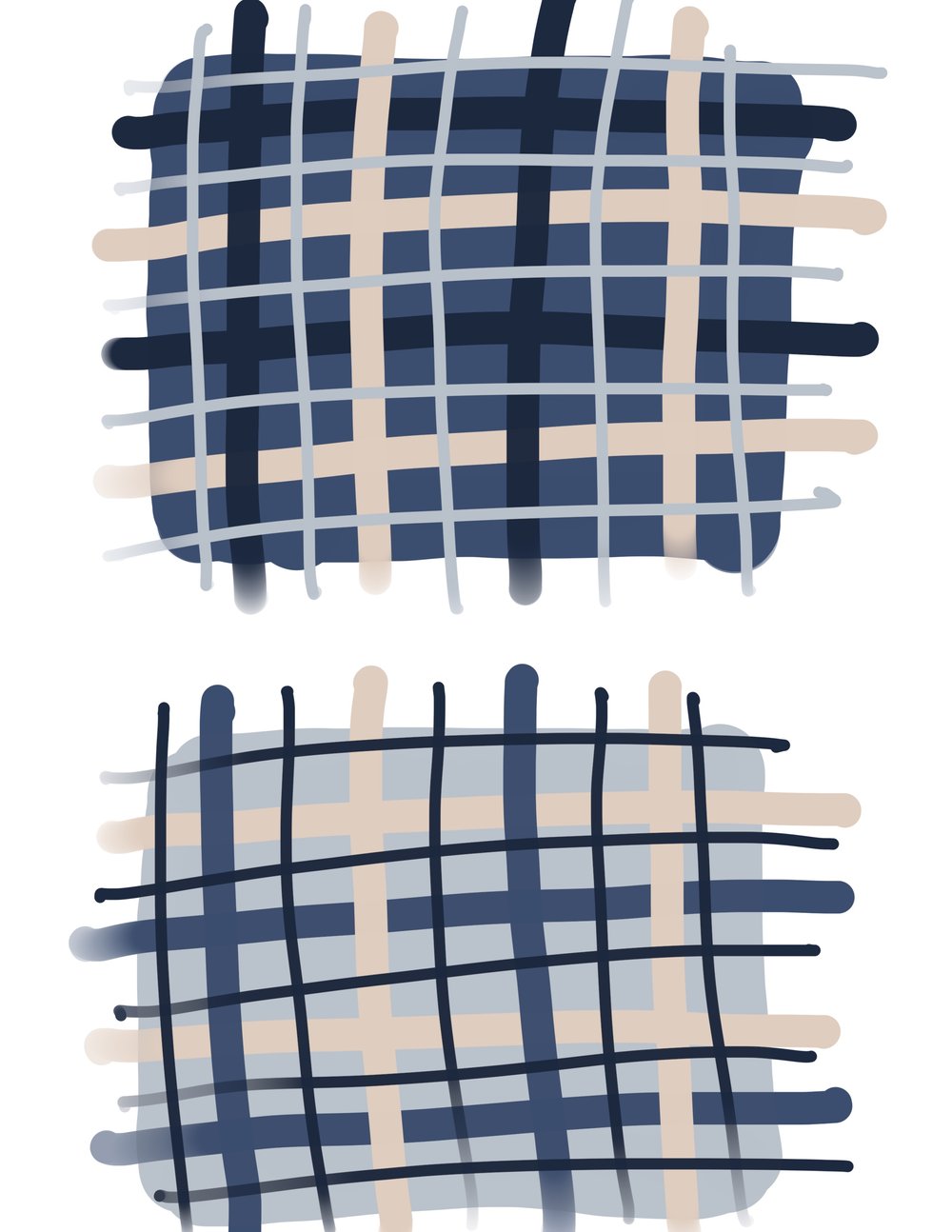
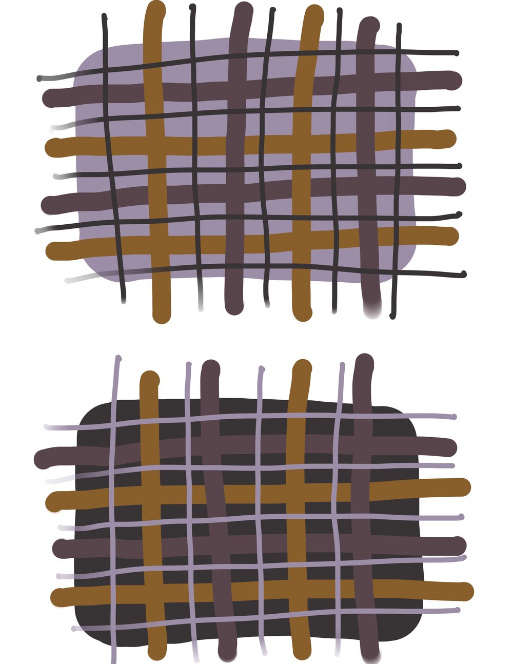
Even after colors, contrasts, and proportions are decided, there’s still room to play! For instance, when I designed my Moonstone and Wildwood Plaid Blankets last year using Hue + Me, I already had the color schemes and plaid layout/proportions decided, but I wasn’t sure which colors to assign as dominant, secondary, and accents. Simply changing the colors around produced a completely different look! Here are my initial sketches for the blankets – you can see how different each one looks by just swapping the accent color with the dominant color.
Wildwood Plaid Blanket
Moonstone Plaid Blanket
Now that you have all of the color theory tools at your fingertips, it’s time to play! Check out Color Theory yarn, available now. Looking for a project? Browse the 12 free patterns here on my blog that were released along with the yarn!