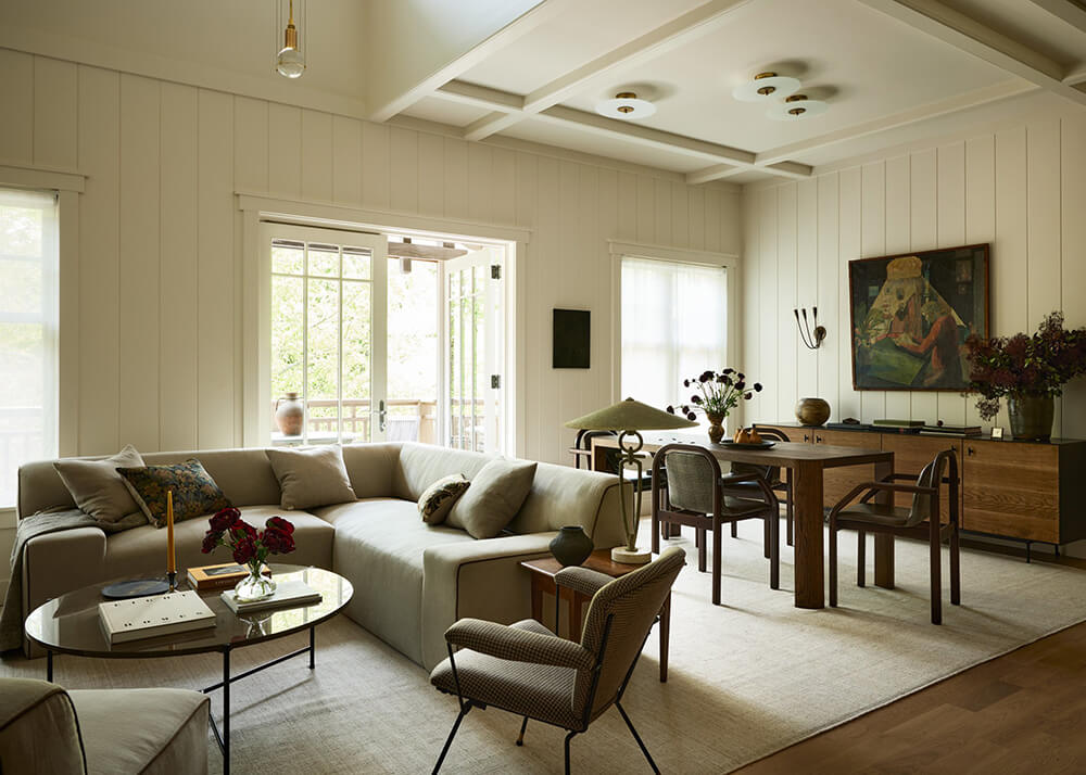
Color and character define every corner of this home (via Kvarteret Makleri). A bold yet considered palette moves through each room with intention, layering earthy greens, warm ochres, and natural wood tones into spaces that feel curated without feeling precious.
Forest Green and White Make the Kitchen Feel Both Grounded and Light
Forest green lower cabinets anchor the kitchen with an earthy richness, while white uppers keep the space open and airy. The two-tone approach is considered rather than contrived, giving the room a layered quality that feels intentional from every angle.

The butcher block countertop introduces a warm, tactile surface that softens the cabinetry below it. Chrome hardware adds a modern counterpoint, keeping the natural warmth of the wood from tipping into too much of a rustic feel.

A white and wood dining table sits at the center of the space, grounded by light oak chairs that echo the countertop’s natural tone. The white fabric pendant above ties neatly back to the upper cabinetry, giving the dining area a cohesive, inviting feel.

Tucked into the corner beside the window, a bar cart fills what could have been dead space with purpose. Sunlit and accessible, it works as both a practical addition and a small moment of warmth in the room’s composition.

Wooden wing doors mark the threshold between the kitchen and the living room with a quiet architectural presence. Their warm tone connects the natural materials throughout the kitchen to the spaces beyond.

Dark Green Pulls the Living Room Into Something Deeply Inviting
The dark green accent wall does something useful here: it visually connects the kitchen and living space without requiring a hard architectural boundary. The color reads as earthy and grounded, giving the open plan layout a sense of cohesion.

A yellow ochre velvet sofa commands the room with warmth, its rich tone vibrating gently against the dark green behind it. The white fluffy area rug beneath introduces lightness and texture, balancing what could otherwise be a heavy palette.

Asymmetric shelving along the wall offers a layered display of books, trailing plants, and small objects. Nothing here feels overfilled; the arrangement is curated enough to feel considered but lived-in enough to feel genuine.

Two-Tone Walls Give the Bedroom a Quietly Graphic Quality
A dark blue stripe runs along the lower portion of the bedroom walls, creating a graphic effect that is bold without being loud. Against this, a mix of beige and white textiles on the bed keeps the mood soft and restful.

A floor-length yellow ochre curtain conceals the wardrobe, bringing the same warm tone used on the living room sofa into the bedroom. The repetition feels intentional, threading a consistent color story through the home.

Shiplap Walls Set a Calm, Creative Tone in the Playroom
Shiplap walls painted in an off-white give the playroom a tactile, textured backdrop that feels warm rather than clinical. The historic building detail adds character to what is otherwise a practical family space.

A blue table and chairs sit confidently against the neutral walls, their color pop cheerful without overwhelming the room’s calm. The contrast is just enough to make the furniture feel chosen rather than incidental.

Built-in shelving lines one wall, holding books, toys, and a single plant with an easy informality. The shelving grounds the room and gives its contents a proper home.

A House-Shaped Bunk Bed Turns the Kids’ Room Into Something Playful and Warm
The bunk bed is built in the shape of a small house, giving the sleeping space a sense of enclosure and coziness that children respond to instinctively. It sits next to the playroom, making the two spaces feel like a considered suite rather than separate rooms.

Up close, the woodwork reveals careful craftsmanship: clean lines, smooth joinery, and a finish that holds up to scrutiny. Attention at this scale is what separates a piece of furniture from something that genuinely belongs to the room.

Dark Green Floral Wallpaper Makes the Hallway Impossible to Overlook
Dark green floral wallpaper covers the hallway walls, adding an unexpected richness to a space that is often overlooked. The pattern is layered and botanical, giving the narrow passage the feel of an entrance that sets the mood for everything beyond it.

A red sideboard stands out against the green tones of the wallpaper, the contrast sharp but not jarring. Together, the two elements make the hallway feel like a curated space rather than a corridor.

Blue Tiles and Gold Fixtures Give the Bathroom Real Presence
Blue subway tiles cover the upper half of the bathroom walls, paired with gold fixtures, a gold mirror, and warm overhead lighting that gives the whole room a considered, jewel-box quality. White tiles on the lower half keep the scheme from feeling too dark, grounding the richness above.

The exposed showerhead and piping carry a classic sensibility, their sculptural silhouette doing more visual work than a recessed fitting ever could. Against the blue tiles, the gold finish reads as warm and deliberate.

Recessed into the tiled wall, a niche offers storage without interrupting the surface. It is a small, practical detail that fits the home’s broader habit of solving things elegantly.

(via Kvarteret Makleri
The post A forest green kitchen and green living room accent wall appeared first on COCO LAPINE DESIGN.