Designer Sammy-Rose Scapens of Homewerk translates her approach to storytelling with colour in small spaces.
What’s the intention behind the small homes you design? They are calm, intelligent and considered, but also full of life and fun. Modest in scale, generous in feeling, they’re built to sit comfortably in the landscape of Aotearoa and to support a good and enjoyable life.

Designing at a compact scale demands clarity. What’s important when shaping these spaces? When a home is small, every decision is visible. We think carefully about light, flow, storage and sightlines. Nothing is accidental. The aim is for it to feel generous, not compromised; small can still feel expansive when it’s thoughtfully designed and built.
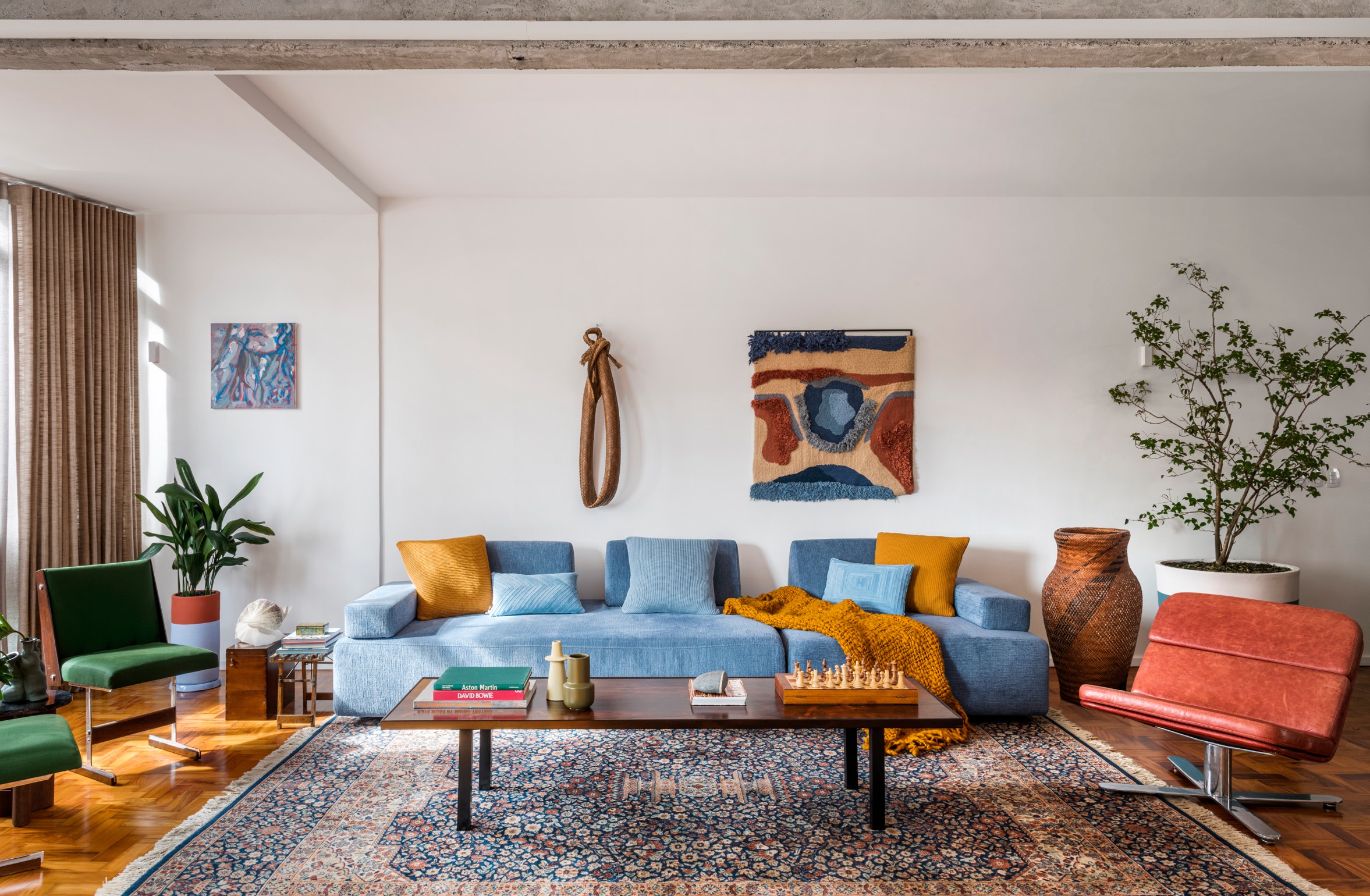
Colour plays a strong role in your cabins. What’s your approach? We believe colour should bring joy. There’s something very Aotearoa about living close to the landscape: the green of native bush, the rust of clay earth, the blue depth of our coastlines. We are also inspired by bold mid-century colour and that sense of fun. For a long time homes have leaned heavily on white and black because that feels safe. But safe is not always joyful. Colour is emotional architecture; it shapes how a space feels. We try not to overthink it, so if you love it, go for it.

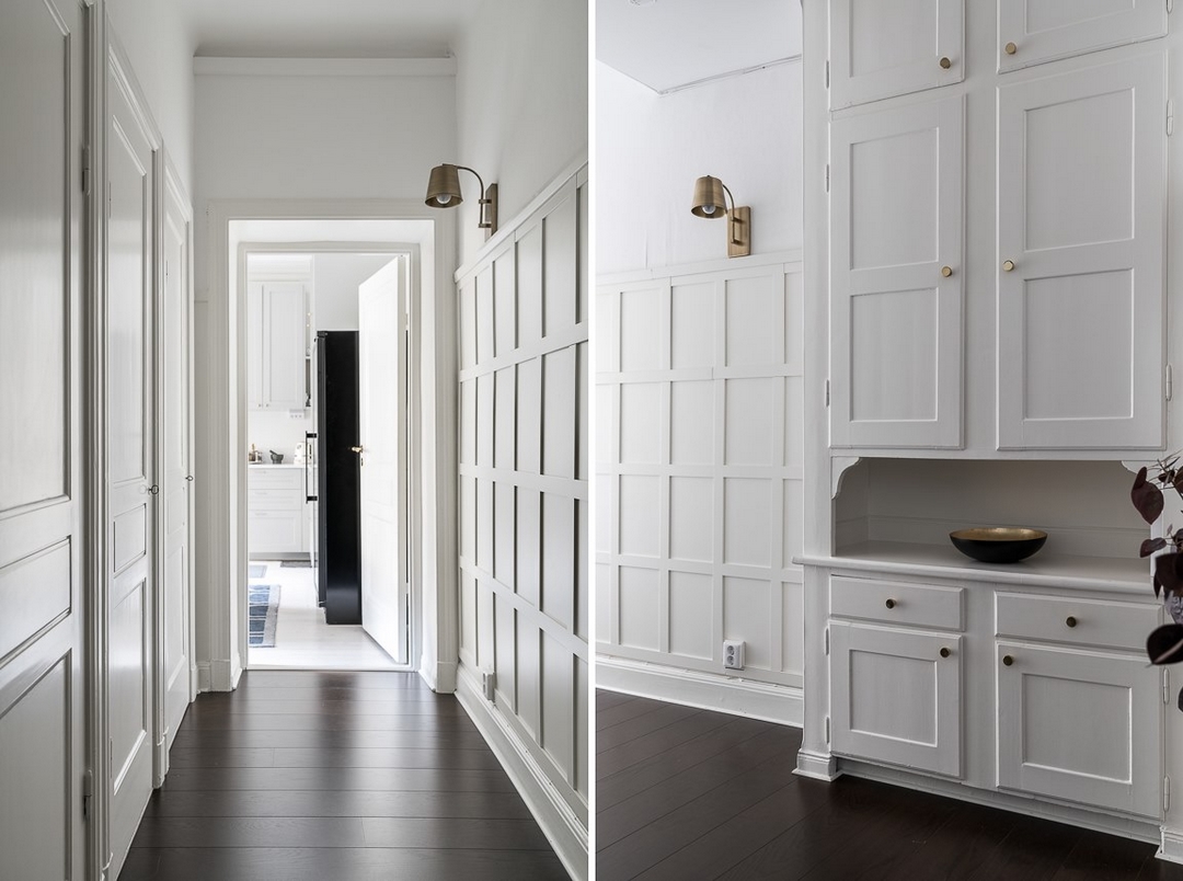
When building a palette for a home, how do you ensure it feels cohesive? We see it as one composition. Usually, a grounding tone anchors everything, then we add a combination of gentle (and sometimes harsh) shifts that move through the spaces. Undertones matter a lot: even when the colour is bold, the overall feeling should make complete sense.
You’ve worked extensively with Aalto Paint across your projects. What resonates with you about their range? We’re drawn to the intelligence behind Aalto’s colours. They feel researched, architectural and deeply considered. The inspiration behind the palette aligns closely with ours. It’s grounded in landscape, materiality and the role of light and shadow. What we especially love is the complexity within each shade. Multi-pigmented layering means the colour shifts as the sun moves and shadows settle. In the bright clarity of morning light, a colour can feel fresh and lifted; by late afternoon it deepens and softens. In Aotearoa, where our light is strong and constantly changing, that responsiveness matters. The colour is not flat; it feels alive. It holds depth and nuance. Like a womb that we live in, these colours can nourish, inspire and calm us.

In the cabins, which Aalto shades became central to the scheme, and why? We kept returning to green, blue and a burnt orange drawn from clay and earth. Green is grounding. In colour theory it sits at the centre of the visible spectrum, which means our eyes adjust to it easily, I think that’s why it feels calm. In Aotearoa, surrounded by bush, green feels familiar as it connects the home to the landscape. Blue creates a sense of space. It can slow the pace of a room and give depth — important in a compact footprint. It allows a small space to feel open, without adding more area. Umbers brings warmth and energy. Together these colours create balance with green to ground, blue to expand, umbers to energise. They reflect the bush, coastline and clay earth. In a small home, colour shapes mood and defines space. It’s thinking of the house as our own mini cosmos. Playing with colour can change the way that mini cosmos feels.

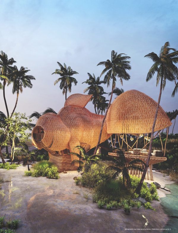
How do you approach the relationship between exterior and interior colour? We keep the exterior more unassuming and use timber claddings and tones such as scoria, lichen and lignite. They sit well in the landscape and allow the home to settle into its site. The exterior is restrained and the interior is more jazzy. We’re not rigid about which combinations homeowners pick. We’ve created combinations that gel together no matter the sequence.

Where do you find colour inspiration for a project? From colour theory and the metaphor of home. Shelter. Hearth. Belonging. Colour has the power to shape feelings and influence hauora/wellbeing. We look outward to the landscape, but also inward. What does this home need to feel like? What do the people living here need more of? It’s at the intersection of what we see outside the window, but also what we see when we look into our own interior landscape.

For someone standing in front of a wall of paint swatches unsure where to begin, what’s a helpful first step? Follow your gut. Ask simple questions. What do I need more of in this space? Calm or energy? Depth or lightness? Which colours excite me? What feels like me? Have fun with it. Paint is one of the least permanent decisions you’ll make in a home. You can always change it later. Often the first colour you’re drawn to is the right one. Go wild — or not. You decide.
aaltopaint.co.nz
homewerk.co.nz

The post Homewerk’s Sammy-Rose Scapens on colour as a brief appeared first on Homestyle.