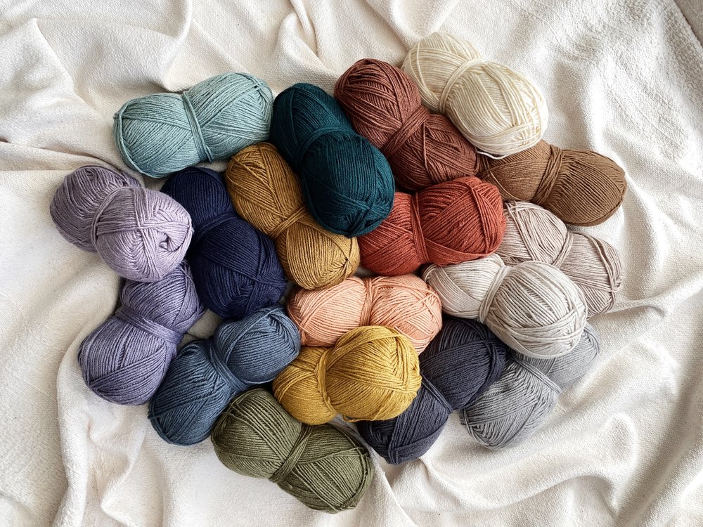
Our final lesson is in regards to color association and psychology as well as the history of different hues. Have you ever wondered why businesses choose certain colors to represent their brands? Have you noticed similarities in the colors chosen by different charities, tech companies, or healthcare products? It is said that up to 90% of our first impressions of a product can be based on color alone! Read on to explore how colors can be linked to our moods, emotions, and feelings.
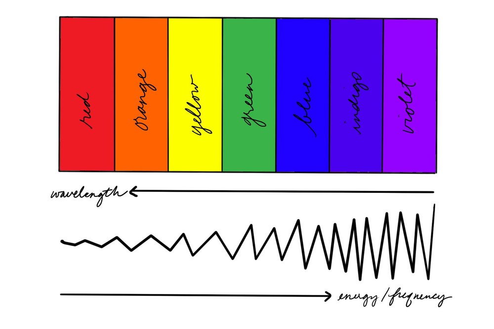
Recent studies into color psychology have explored how different colors’ wavelengths are transmitted to our brains via the optic nerve, where they may influence the hypothalamus which controls our endocrine glands and therefore our hormones. It is thought that different colors may cause specific effects to our physical and emotional responses. Carl Jung said, “colors are the mother tongue of the subconscious,” and believed that they could heavily influence human behavior – everything from stimulating hunger, inducing healing, and attracting a mate.
Our associations with color may be objective and general, or they may come from cultural and religious teachings or other influences like familial traditions, personal experiences, or even the media. For example, it is pretty universally accepted that red means “stop,” while green in Ireland is associated with luck but in Mexico it represents independence. Some color associations are deeply in historical context and can shift over time, and oftentimes a single color can represent wildly different things across different cultures.
One of my favorite examples of this is how in today’s US culture, pink is associated with girls while blue is associated with boys. Up until the 1950s, boys mostly wore pink because it was a tint of red which was seen as a strong, more active color while blue was considered more peaceful and calm for girls. It wasn’t until President Eisenhower’s wife Mamie wore a pink dress to his inauguration, which served as a symbol of rebirth and emergence from the war, that the color began to represent feminine domesticity and therefore little girls.
Marketers and advertisers often use the psychology of color to manipulate consumer choices. You may be subconsciously drawn to certain colors because of the emotional response they give you without even consciously being aware of it, which could affect your shopping habits. Even modern day filmmakers will tint scenes or entire movies or shows to set the mood for the scene or to distinguish between the feeling of different locations. Ever notice how the locations in Game of Thrones all have different over colors to them? The show even had a steady shift from warm light to cool light over the course of its seasons to indicate the idea that “winter is coming.”
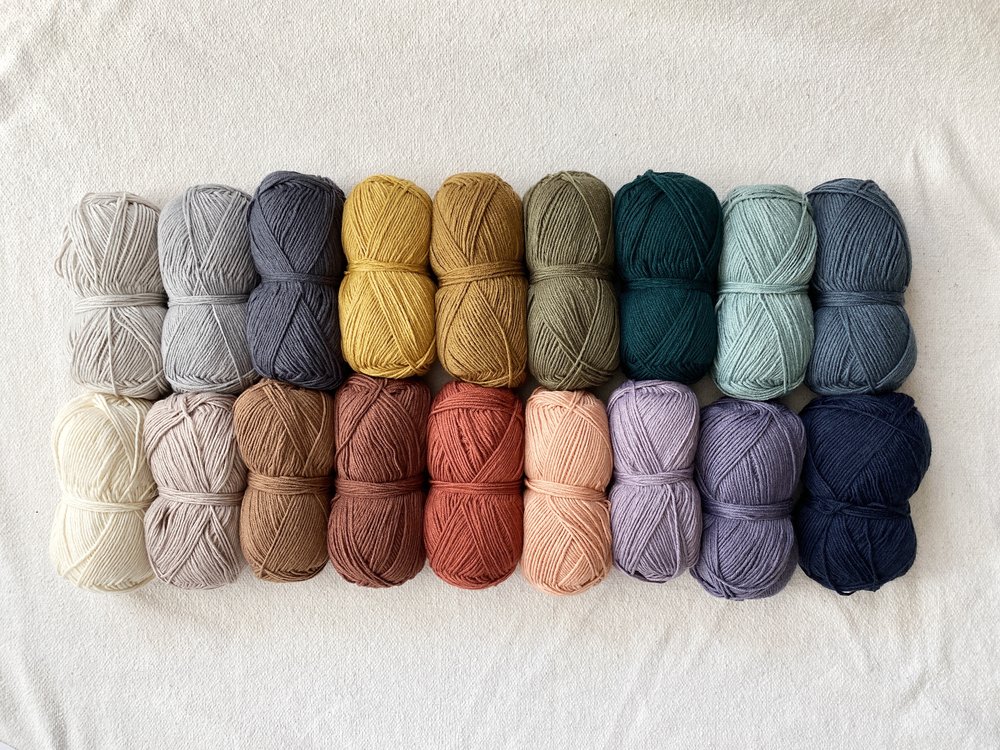
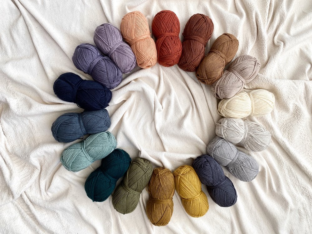
In general, here are some examples of the feelings and moods associated with the most common colors:
Red: passion, danger, power
Orange: creativity, energy, vitality
Yellow: active, joy, hopeful, utopic
Green: nature, health, fresh, abundant, soothing
Blue: wisdom, calm, meditative
Purple: ambition, wealth/royalty, spirituality
Black: mourning, power, mystery, elegance
Grey: moody, conservative, neutrality
White: purity, peace, cleanliness
Brown: natural, wholesome, dependable, grounding
Now let’s take a look at some of the history behind these colors, which likely influenced the feelings we have about them.
RED
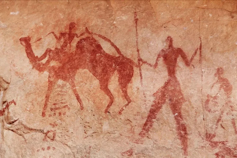
Red is the first color pigment known to be used by mankind, as is evident by the earliest cave drawings using it, mainly because it was the most accessible. It was found in clay thanks to the mineral hematite which made it widely available as well. Aside from cave art, it was used in earthenware, jewelry, clothing, and the earliest forms of makeup. From the earliest of times it has represented strength since as a color it literally pops out and demands attention, therefore increasing the heart rate. Since red is opposite on the color wheel to green (considered soothing and connected to nature), red is also associated with danger or an alert.
Red is also the color of fire and blood, carrying both negative and positive connotations – on one side aggression and bloodshed, and on the other passion and love. In many Asian cultures it symbolizes joy and good fortune, with brides wearing red as a symbol of fertility and luck. The association with the blood of Christ in European countries made red an important color for the Catholic church, with the cardinal being named after the color that Roman Catholic cardinals traditionally wore.
ORANGE
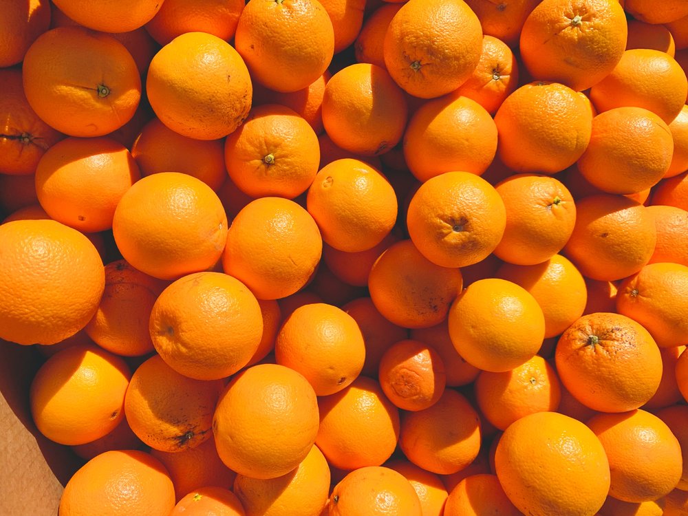
It wasn’t until the 16th century that the color orange was actually named in the English language, likely because the pigment was so difficult to produce until then. When oranges (the fruit!) were brought by traders to Europe from Asia around that time, the color began to take off. Not all of these oranges were edible, so they were used for medicine, cleaning, fashion, and even invisible ink! Startling red is warmed by cheerful yellow to create the orange hue, which produces a less urgent feeling and makes orange perfect for use as a warning sign. Traffic cones, high visibility clothing for construction crews and bikers, lifeboats and safety equipment all utilize this color.
Orange is very significant in Hinduism and Buddhism, where the color represents the fire or inner transformation experienced by swamis. Some studies have shown that exposure to orange light can positively affect our circadian rhythm, improving our alertness and cognition as well as encouraging relaxation by triggering melatonin production. Orange offers a strong balance to blue, and was hugely important to impressionist artists. Van Gogh once said, “there is no blue without yellow and without orange.”
YELLOW
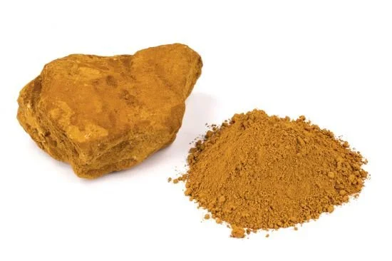
While darker shades of yellow were among the first used by humans thanks to the yellow ochre pigment made from the mineral limonite, nearly all of the early bright yellow pigments were made of highly toxic elements like lead and arsenic, and chrome, and it wasn’t until synthetic pigments were created in the late 19th century that the color was able to be widely used by modern artists and designers. Today, innovation in plant-based dyes have made more natural yellow hues possible as well.
The color of the sun, yellow was originally considered the color of the gods. It is associated with wisdom and knowledge, as well as autumn and maturity. One of the brightest colors to the eye, yellow is used as a caution, adorning chemical labels, yield and other road signs, taxi cabs, and school buses. Yellow has many conflicting meanings amongst different cultures, from envy, jealousy, and cowardice to joy, spontaneity, and gentleness.

GREEN
Green is the color of life – of vitality, fertility, spring, renewal, and hope. It was originally a difficult color to produce outside of nature. Green pigments made from malachite were used by ancient Egyptians in stoneware and paintings, but these were often unreliable and turned black over time. Ancient Greeks then began soaking copper in wine to create one of the first synthetic pigments called verdigris. You may have seen this patina on copper gutters and roofs or old coins. But again, it proved to be a highly unstable pigment that changed over time.
Green dyes have a notoriously dangerous and deadly history. Scheele’s Green, a bright green hue made with arsenite (a toxic chemical), was developed by Swedish chemist Carl Wilhelm Scheele in 1775 and became so popular that it was widely used in fabric, toys, and paint. Rooms painted in the color and clothing made from fabric dyed in it were finally linked to poisoning by the end of the 19th century when a similar color called Paris Green replaced it; however, this proved to be just as toxic and is thought to have been the culprit for several impressionist painters’ demises such as Cézanne’s diabetes and Monet’s blindness. It was finally banned in 1960. Although green represents nature, freshness, and growth, to this day producing green dyes and pigments is still difficult and many continue to contain toxic substances.
BLUE
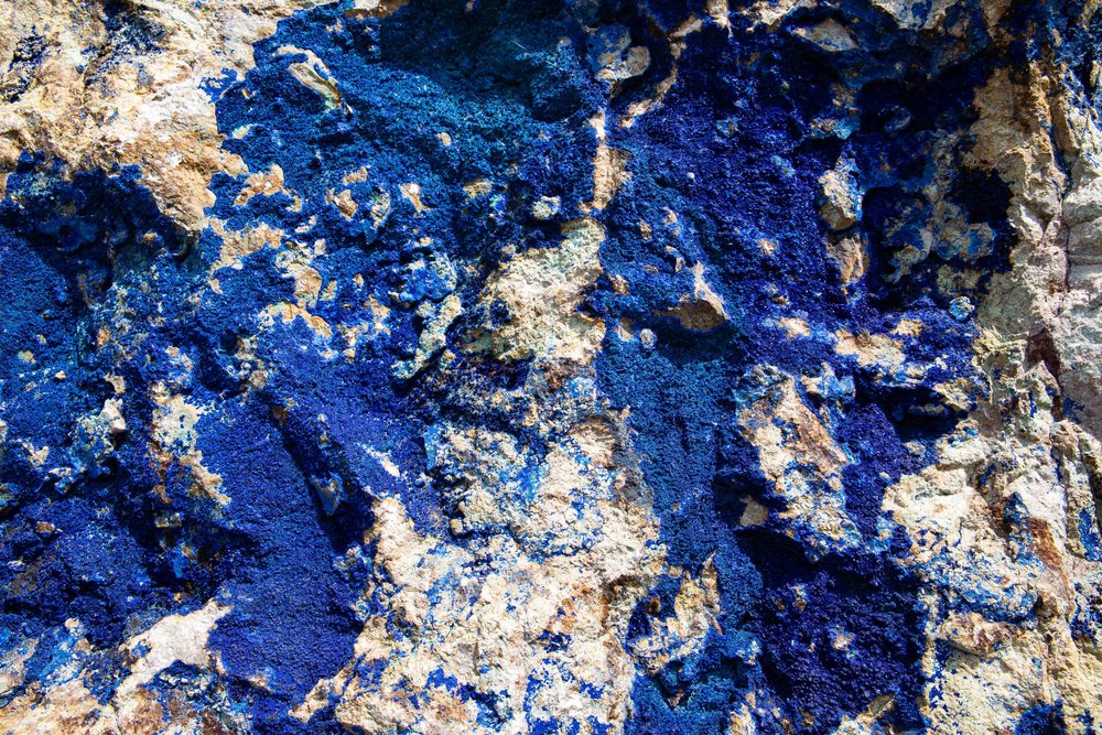
The color of the sky and water, blue is the most prominent color in the natural world. Some scientists believe that the earliest humans were actually colorblind and could only recognize black, white, and red, then later yellow and green, and finally blue. Like with many pigments, it was the ancient Egyptians who first formed a blue dust from lapis lazuli and azurite that was used for decorative arts. The color has evolved since then in availability, but it had a long history of being rare and reserved for the rich and powerful. Prussian blue was developed in the early 1700s and became the first modern synthetic pigment.
A symbol of innovation, blue is a popular choice for media and tech companies when it comes to logos and branding. It has gained an association with the world of science as well as spirituality, balancing two often opposing worlds. Today we see blue as the symbol of more grounded principles like fidelity and faithfulness as well as more spiritual principles like heaven and meditation.
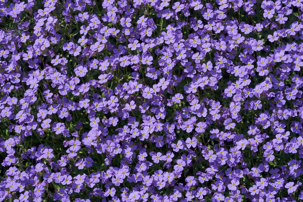
PURPLE
Purple, not only the the hardest color for our eyes to detect, is also the most rare color in nature. While the terms “purple” and “violet” are often used interchangeably, purple is technically a mixture of red and blue, whereas violet is a specific spectral color. The rarity of the color led to it being associated with the elite, and after it was adopted by Julius Caesar and Cleopatra as a favorite hue it became the color of emperors and royalty, with specific rules over who was allowed to wear it. The expensive nature of the pigment, which was created by murex snails in extremely small batches, kept it from being mass produced for centuries.
The first synthetic purple pigment was actually created in 1856 by accident when an English teenagers named William Henry Perkin was attempting to synthesize an anti-malaria drug called quinine and created a purple compound that could be used to dye silk and most importantly, retain its color. Later known as “mauve,” it became all the rage in Victorian England. Purple became a central color in the women’s suffrage movement and has been since associated with social change. Today purple continues to represent nobility, luxury, and status as well as divinity, the supernatural, and mysticism.

BLACK
Made from charcoal, carbon black was the first black pigment and it is still in use today. Signifying death and ash, this caused black to be associated with mystery, evil, mourning and sorrow. Black is essentially the absence of color, which leads it to represent minimalism and by association, elegance. Due to its high contrast with white paper and computer screens, black is the most common color for ink and text. Black has also come to represent submission, for example as the color worn by priests and nuns, as well as experience, for example as a mark of achievement in martial arts.

GREY
Grey has long been a utilitarian color. The color of concrete, stone, and silver, it is seen primarily as a supply, resource, or building material. Throughout the middle ages, grey was most commonly worn by peasants and the poor since it was the color of undyed wool. It was worn by Franciscan monks as a symbol of their vows of poverty and humility. When black became a popular color among the nobility during the renaissance, grey came into fashion as a derivative of it. It became the most popular for portrait backgrounds for its ability to highlight gold and skin tones. Because of its versatility and ability to take on a vast array of cool and warm temperatures, grey is a strong tool for designers.

WHITE
While black is the absence of color, white light is actually the presence of ALL color, but it often represents a void and the lack of it. In many cultures the color white represents peace, purity, and innocence and is worn for ceremonial purposes. Like many other pigments, white was historically toxic due to its lead content until the late 20th century when it was banned. Because lead white was used to prime canvases and tint all hues to form lighter colors and highlights in not only paint but cosmetics, it affected many “colors” in a fatal way as well. Nowadays white represents cleanliness and safety which is ironic given its history. It has also come to signify minimalism since the idealization of clean empty space in late 1950s art that has influenced modern day brands such as Google and Apple.

BROWN
Brown, the color of the earth, has long represented grounding, reliability, and wholesomeness. Similarly to grey, it was often the color of clothes left to the poor who were unable to afford brighter, rarer colors, and it became another symbol for humility for monks’ robes. Browns have been notably important to artists for centuries in order to create shadows and a sense of realism in their work. Brown is actually not a hue but a low shade of yellow, orange or red, and it can be made from primary colors by mixing blue with yellow to get green and then mixing green with red; or, by mixing orange or red with black.
Understanding the history of anything, including color, can help us make more informed decisions in the present, but I’ll end by saying that color theory is merely a guideline, and while I have laid out some general “rules” and ideas through this series of lessons, choosing colors really comes down to what makes you happy!