Today launched their 2019 color card here in Oslo, a color card reflecting the tendencies in our society. No wonder we seek to Jotun for inspiration and trends, they are very much one of the trend makers. The color card is called Identity and it explores the colors that characterize and reflect modern urban lifestyle around the world. We want to express our identity through where we live, through fashion, through the music we listen to and through our homes. Our homes is not for showing off for guests, the home of 2019 simply says “this is me” and we aspire to create homes that expresses our values, our interests and our personality.
The first photos is from the launch earlier today where team Jotun with stylists Kråkvik and D´Orazio had created a very inspiring exhibition showing the three different themes of the color card.
Photos 1-5 © Elisabeth Heier
Following photos from Jotun Lady, photographer Line Thit Klein, stylists Jannicke Kråkvik and Alessandro D´Orazio.
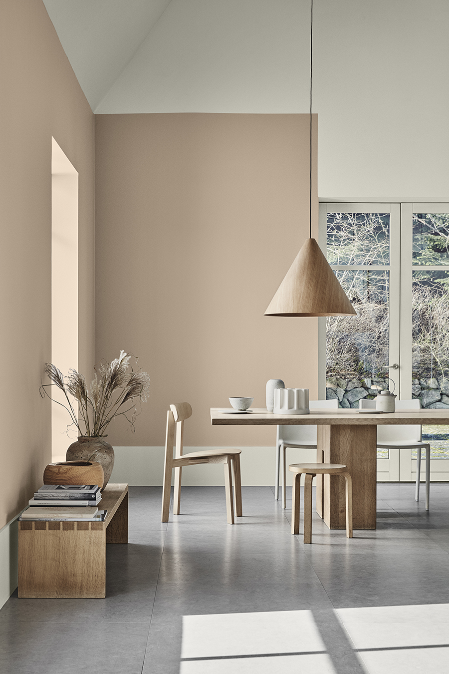
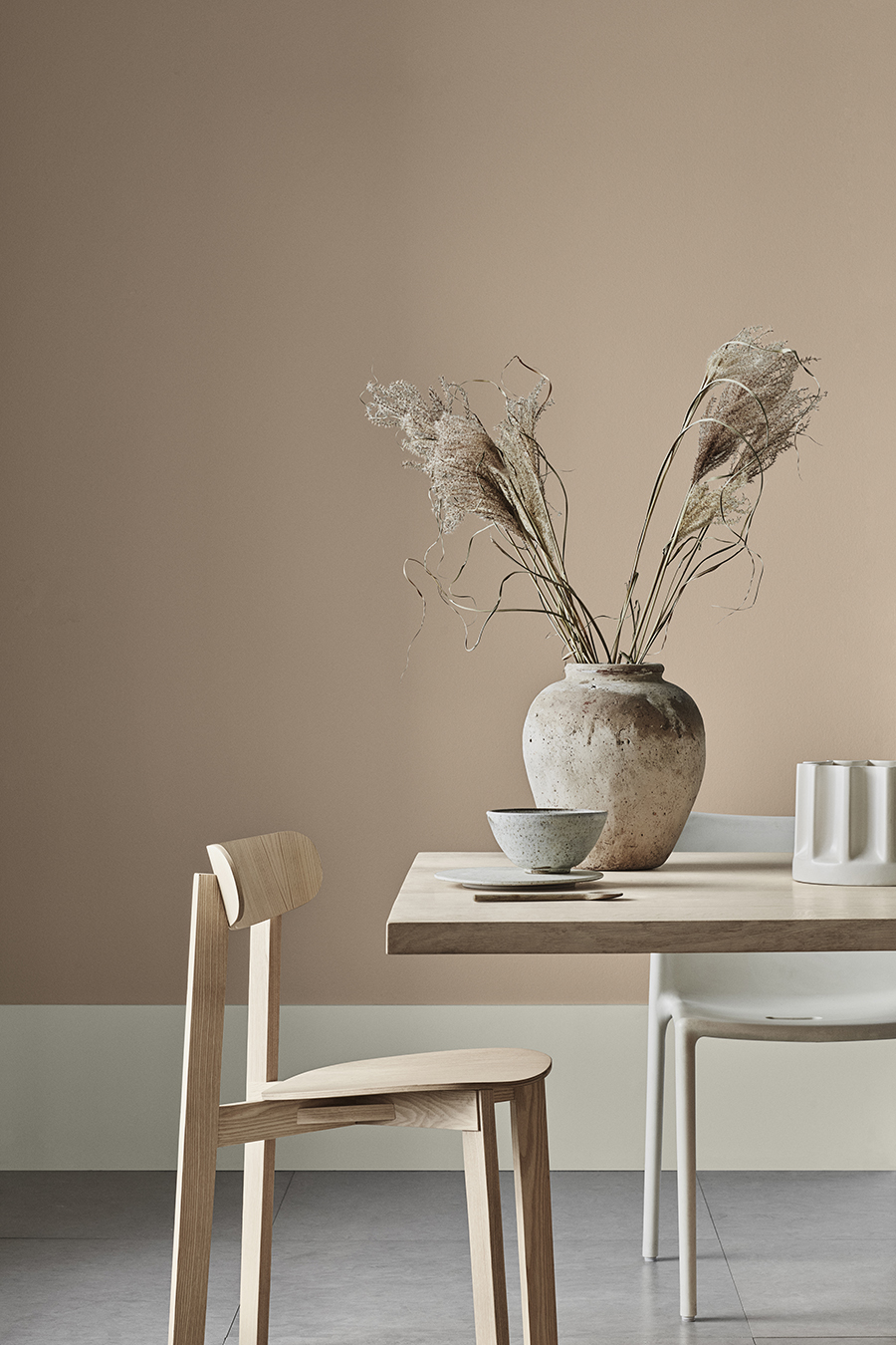
Wall color LADY Pure Color 12083 Divine, skirting board and upper part of wall LADY 1024 Timeless
“Home is the living story of who we are, told in the objects and colors we fill it with” – Lisbeth Larsen, Global Color Manager at Jotun. Compiled over a year by the Jotun colour specialists in Sandefjord, Norway, and incorporating on the insights of a global network of colour-trend researchers – Lisbeth and her team have translated their insights into a palette of 28 shades to be added to Jotun paint range. To illustrate how different colour combinations can be employed to communicate different identities, Jotun has identified three distinct, globally resonant themes, each describing an individual mindset and way of living – the story of an individual, told in colour.
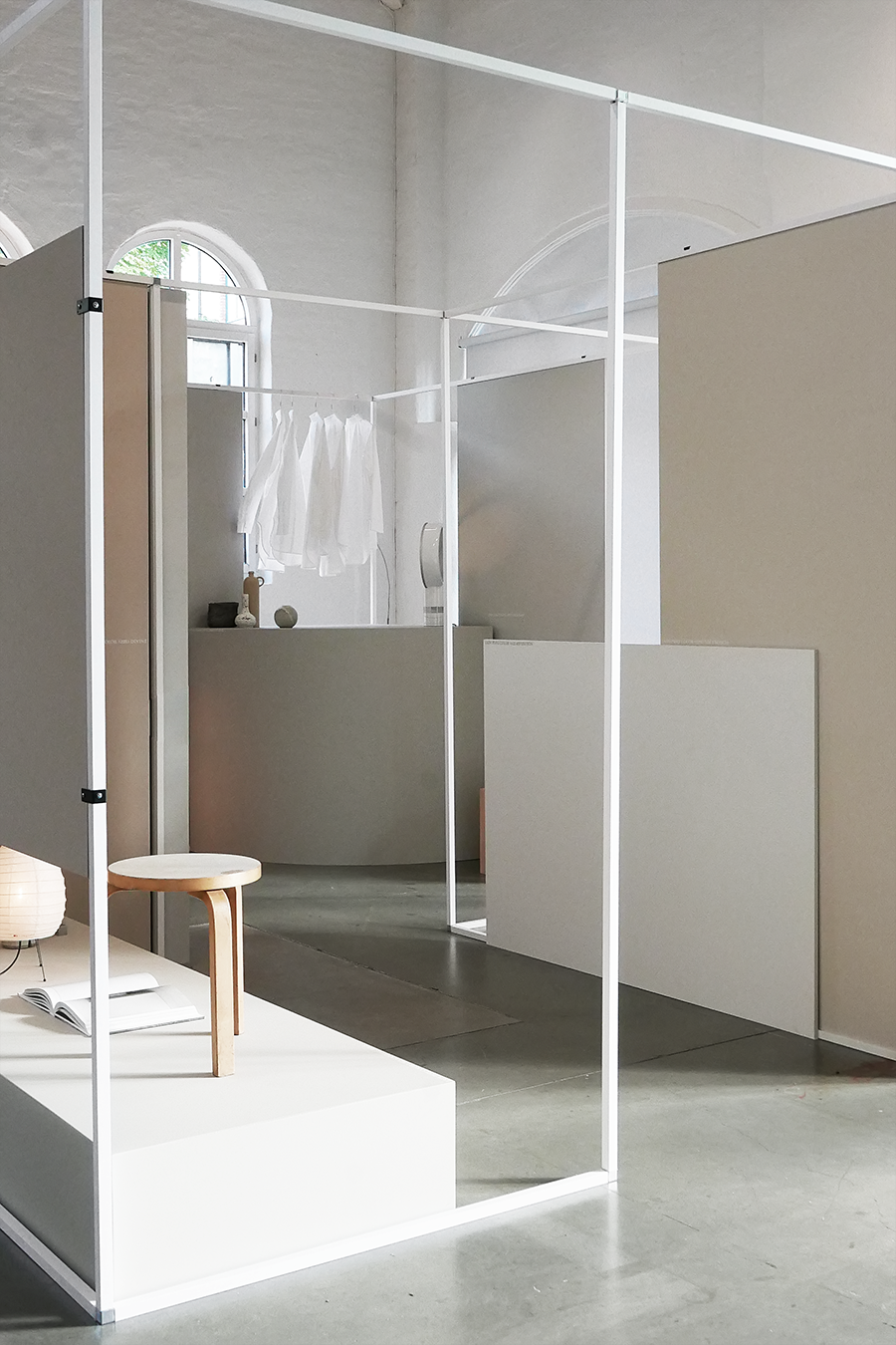
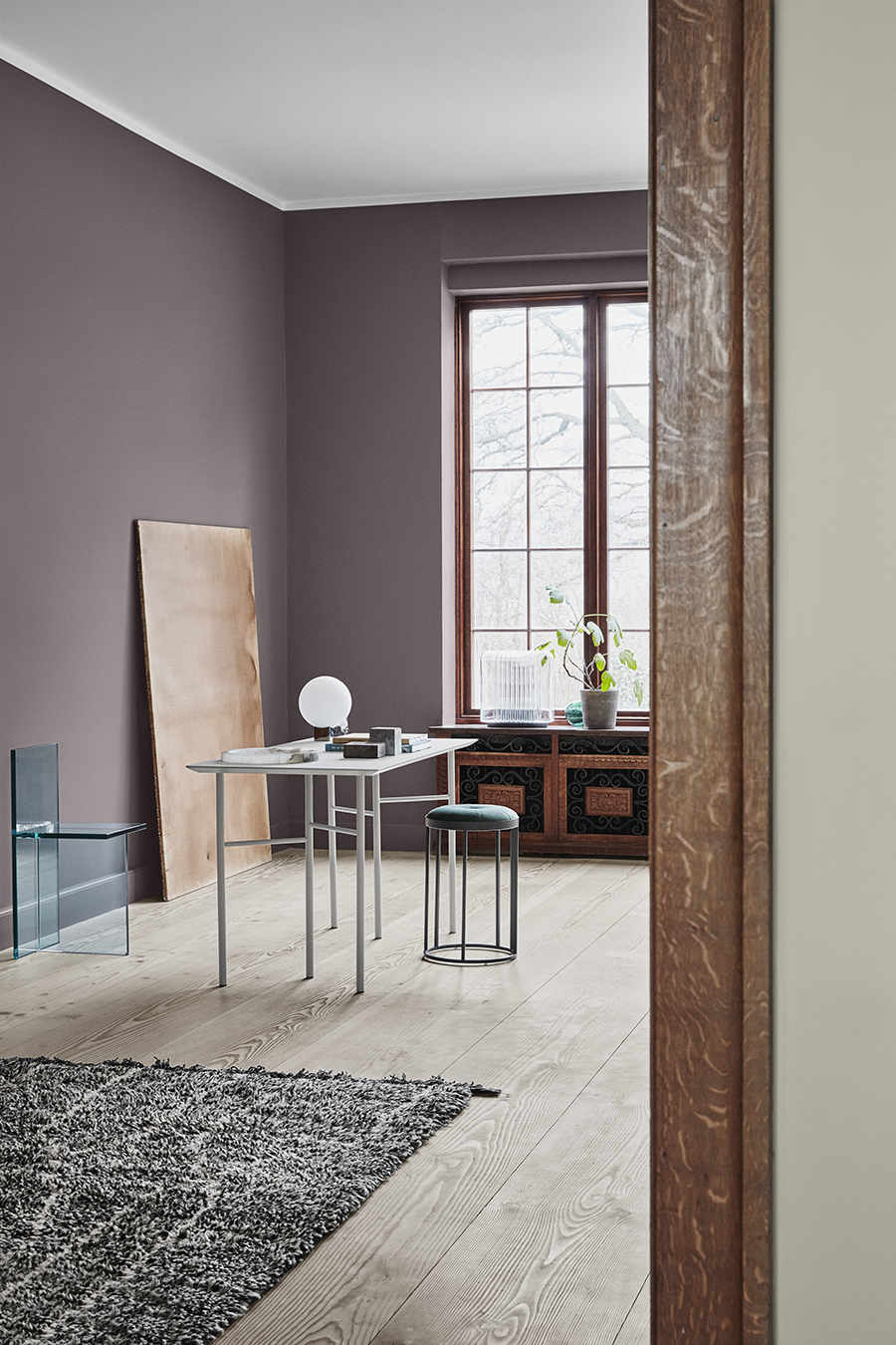
CALM
Soft, light neutrals and warm, subtle contrasts. The calm identity prizes meaning above quantity in the things they surround themselves with, revelling in the almost-Nordic simplicity of their space. Their home is a refuge of clean, easy living and a place of peace, a Zen sanctuary given character through a handful of choice artworks or objects that carry deep personal significance. Nothing is superfluous; there is no room for clutter. Everything has a place and a reason to be in it. Calm is a color theme with warm greys and beiges, who we call neutrals. All three themes intertwine and colors can easily be combined and mixed. The sensuous peach colors from the theme called Raw is beautiful together with the neutrals.
Wall color LADY Pure Color 12083 Devine, skirting board LADY Supreme Finish Matt 1024 Timeless
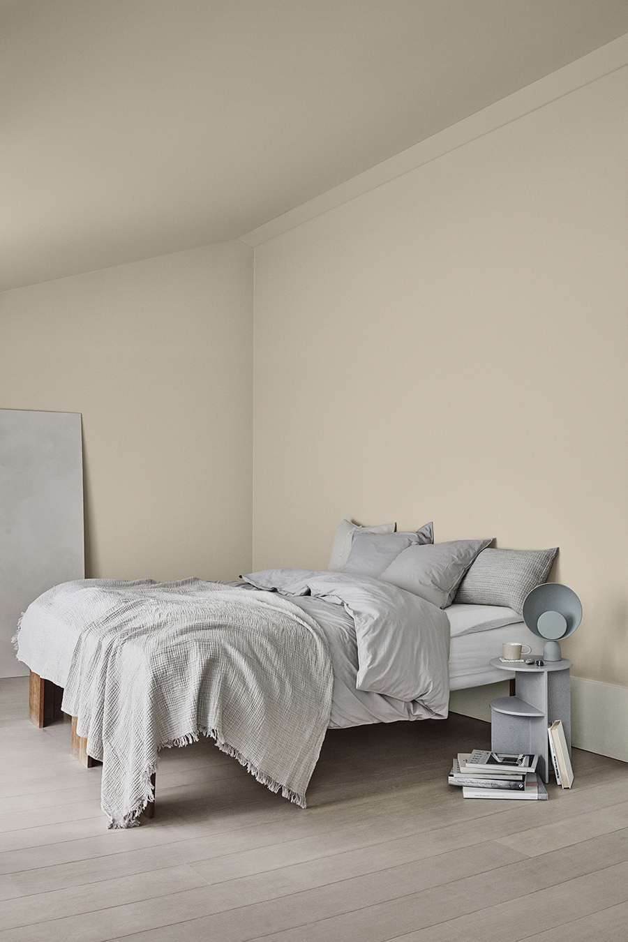
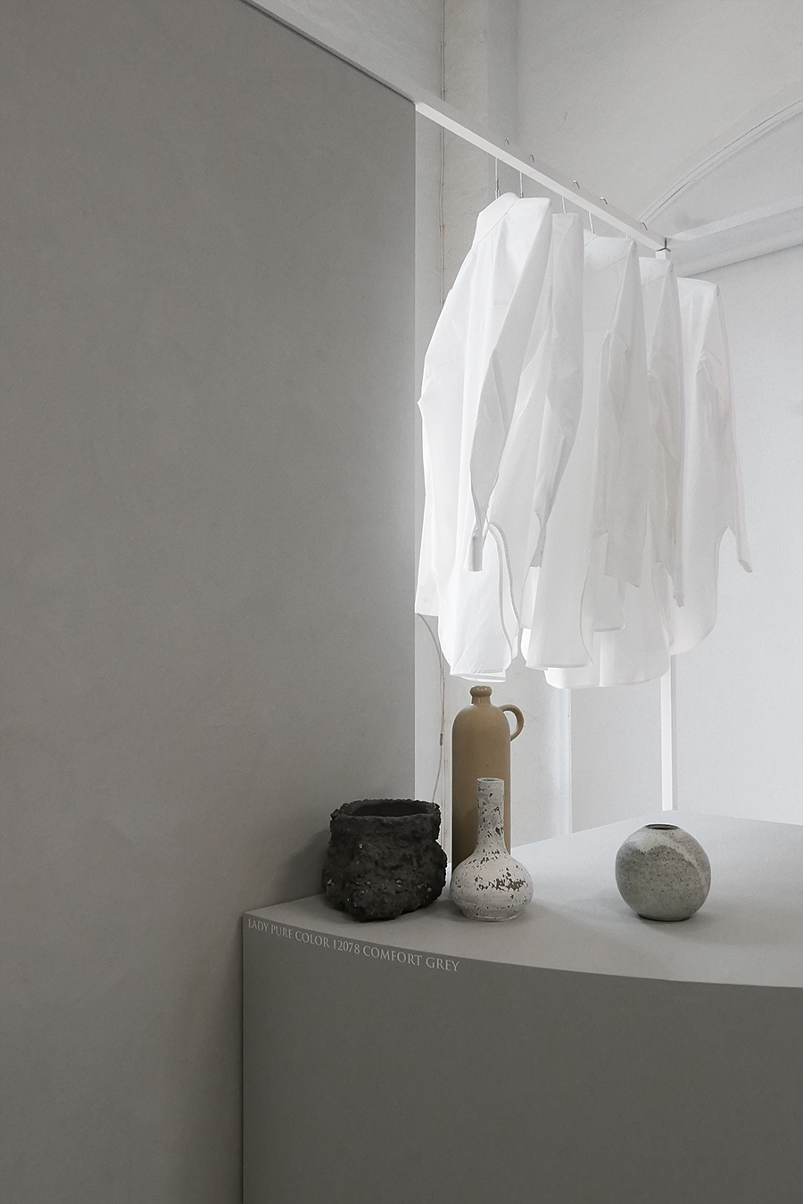
Wall and ceiling LADY Pure Color 12075 Soothing Beige, skirting board LADY Supreme Finish Matt 1024 Timeless
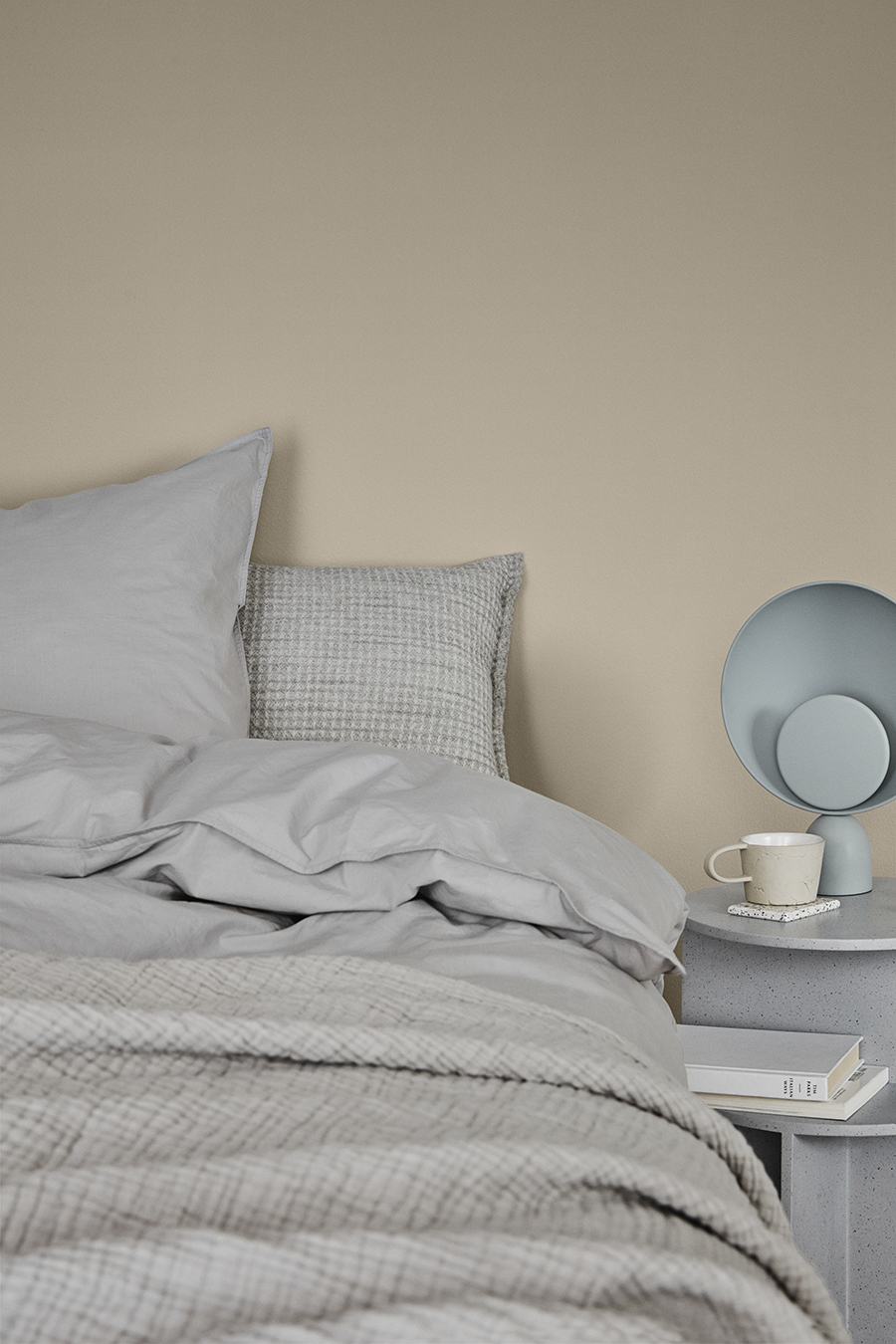
Wall color LADY Pure Color 12075 Soothing Beige. A great example on how good it can look mixing grey and beige colors.
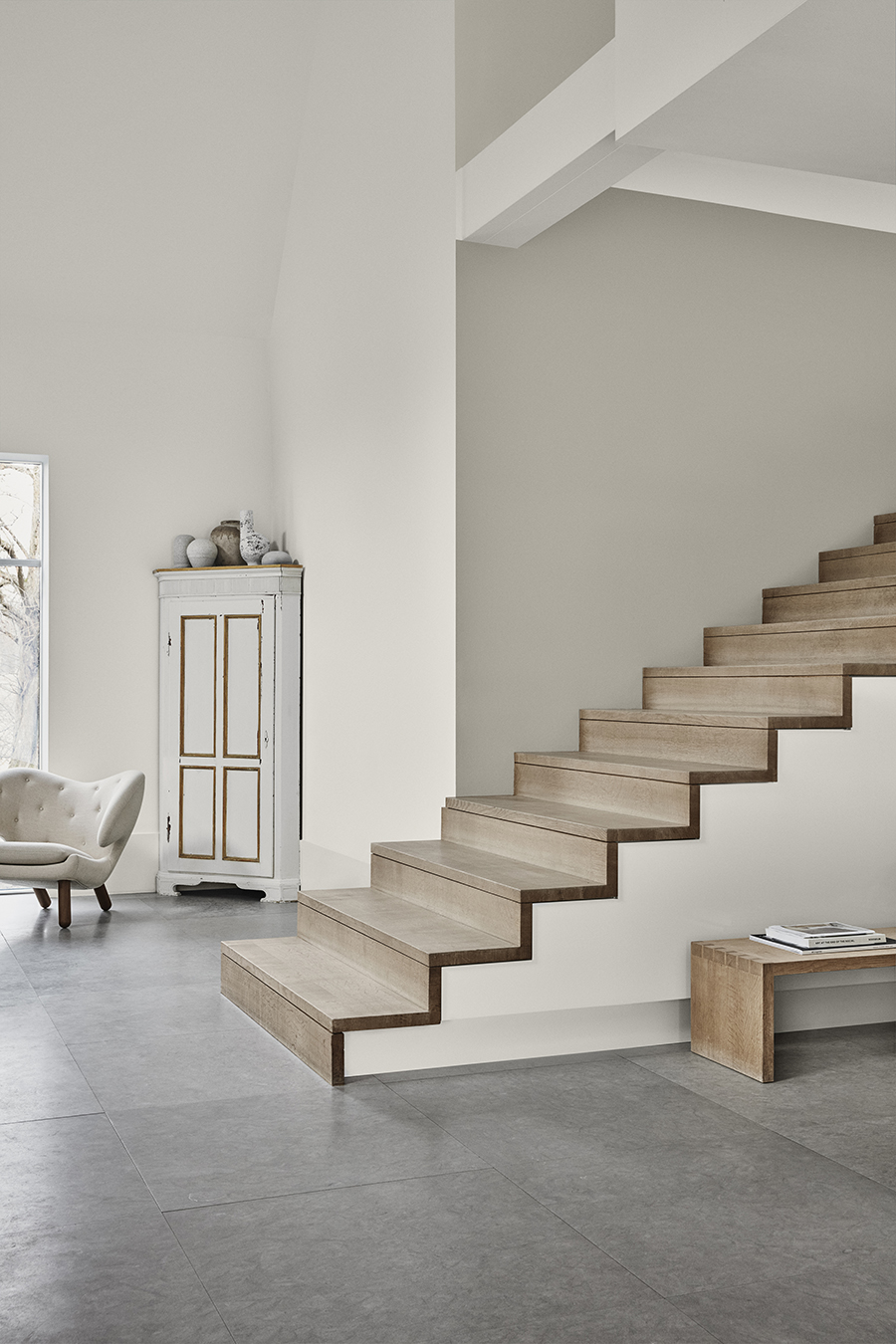
Wall above stairs LADY Pure Color 12078 Comfort Grey, wall left side LADY 1622 Reflection
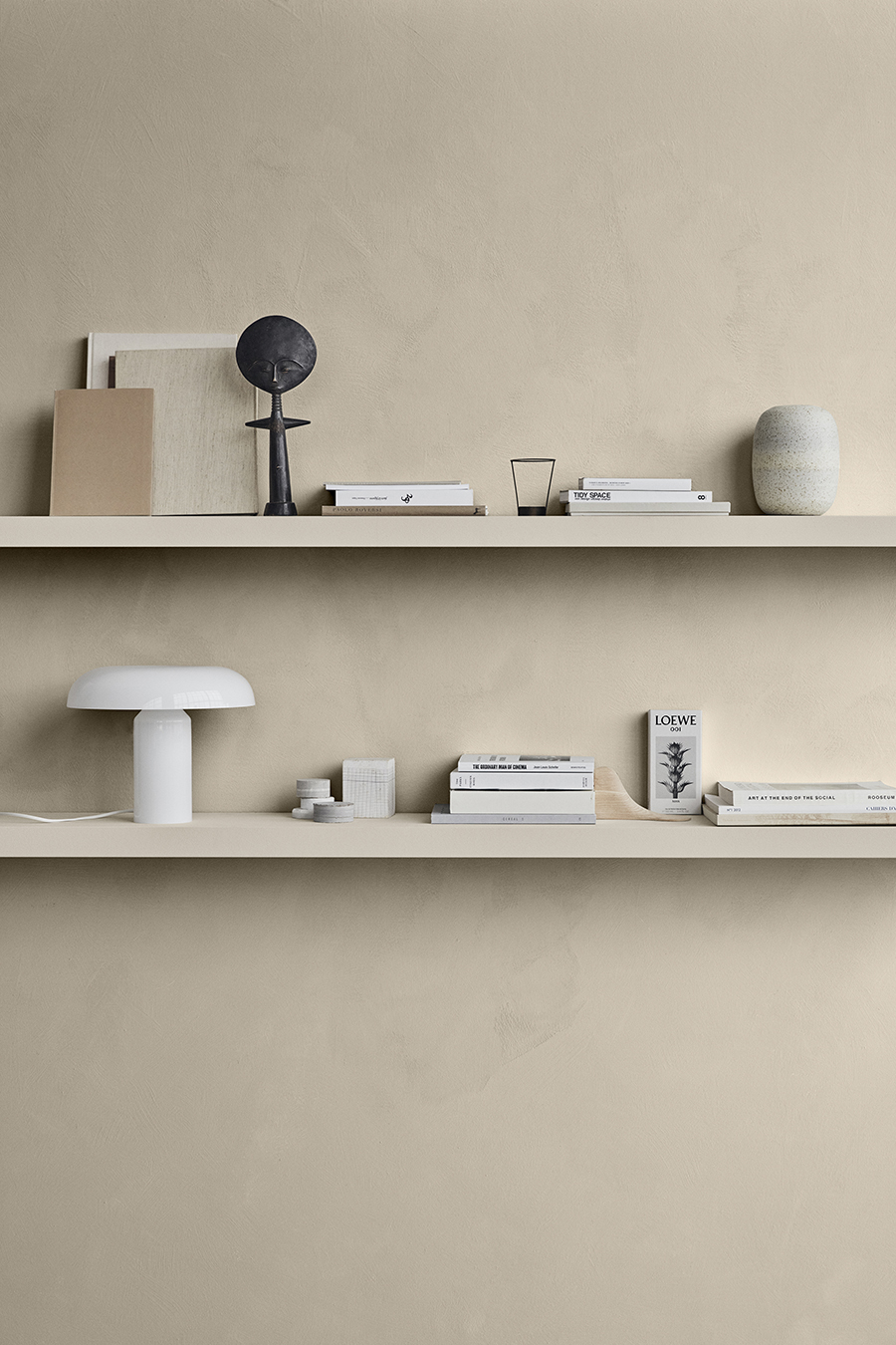
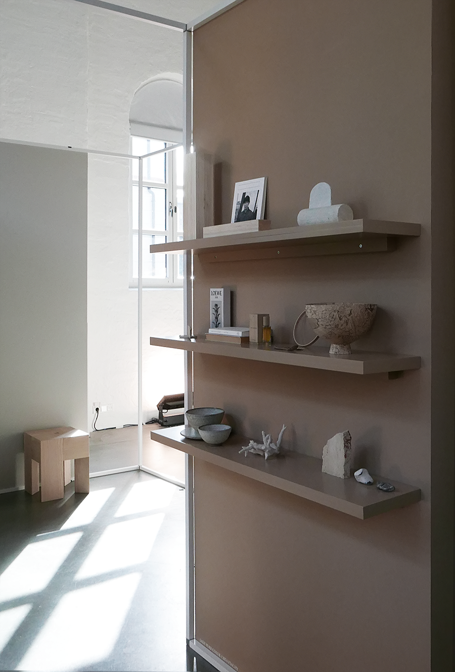
Wall color LADY Minerals 12075 Soothing Beige, shelves LADY Supreme Finish Matt 12075 Soothing Beige
Lady Supreme Finish 80, 12078 Comfort Grey
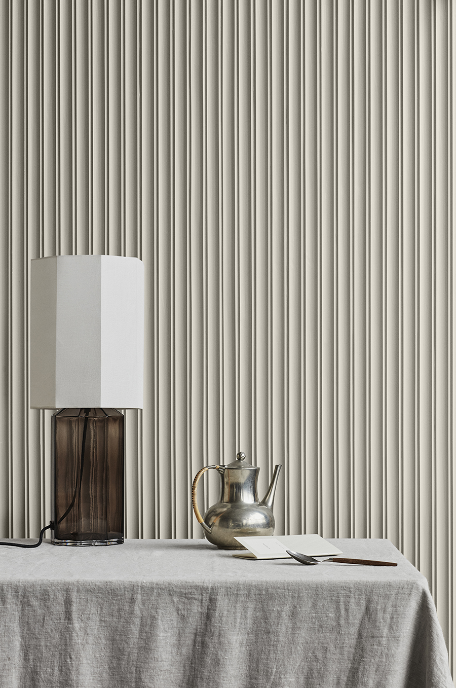
Wall color LADY Supreme Finish 10678 Space
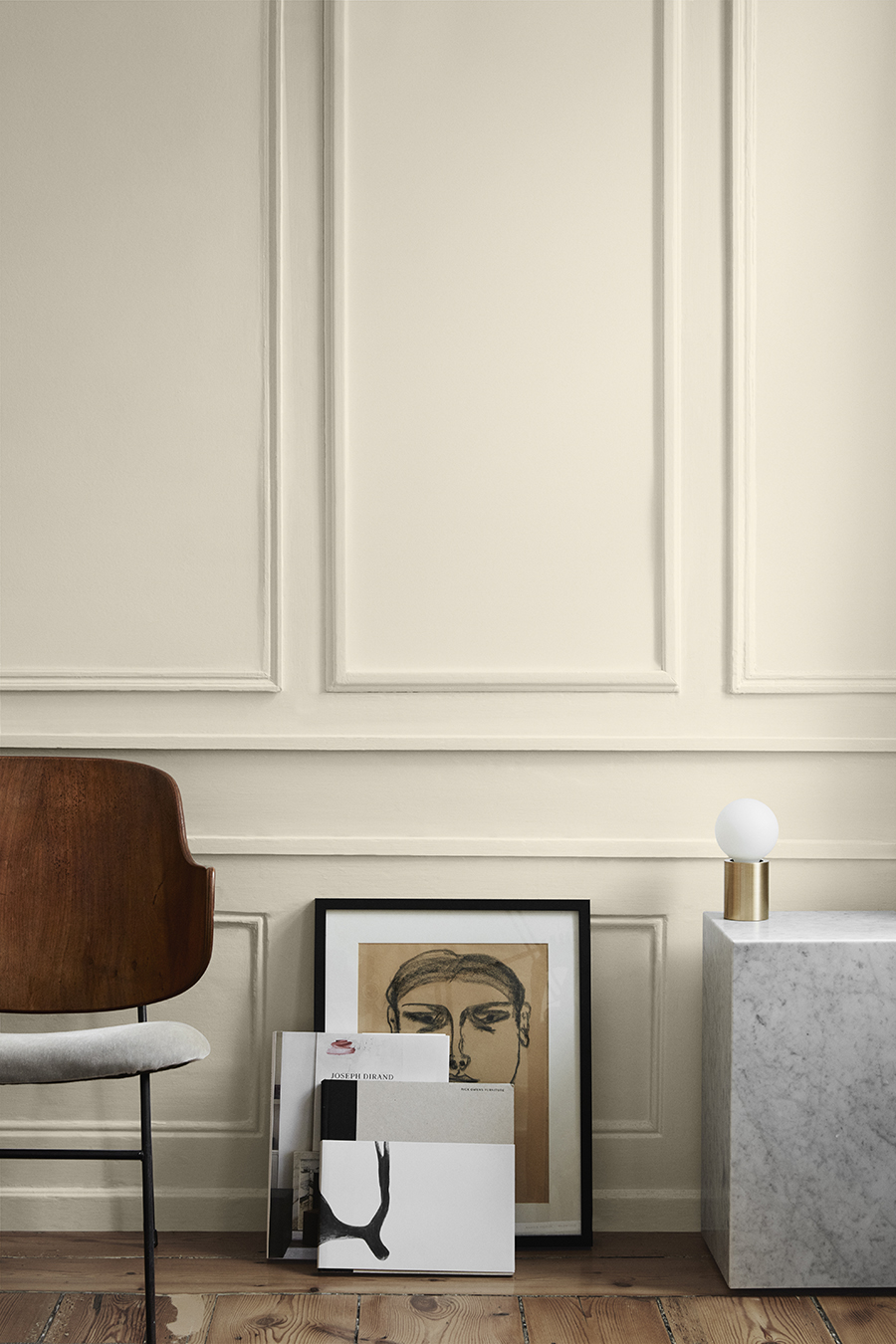
Wall LADY Pure Color 3377 Slate Lavender, skirting board LADY Supreme Finish Matt 3377 Slate Lavender, ceiling LADY Perfection 9918 Classic White
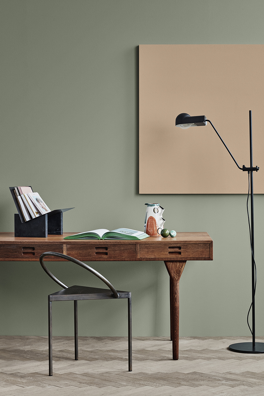
REFINED
The second theme consist of sense-stimulating greens and yellows, given depth with different textures. The refined identity is that of the modern-day curator: discerning, considered and interested in intriguing juxtapositions. Their home is dotted with a seemingly eclectic collection of art and artefacts, vintage pieces and contemporary design, all carefully positioned in order to acquire new meanings in their relationship with one another. This home is a personal gallery – a dialogue between colour and object whose whole is greater than the sum of its parts.
LADY Pure Color 7628 Treasure, skirting board LADY Supreme Finish Matt 7628 Treasure, ceiling LADY Perfection 7236 Chi
Wall LADY Pure Color 7628 Treasure, board LADY Pure Color 12084 Dusky Peach
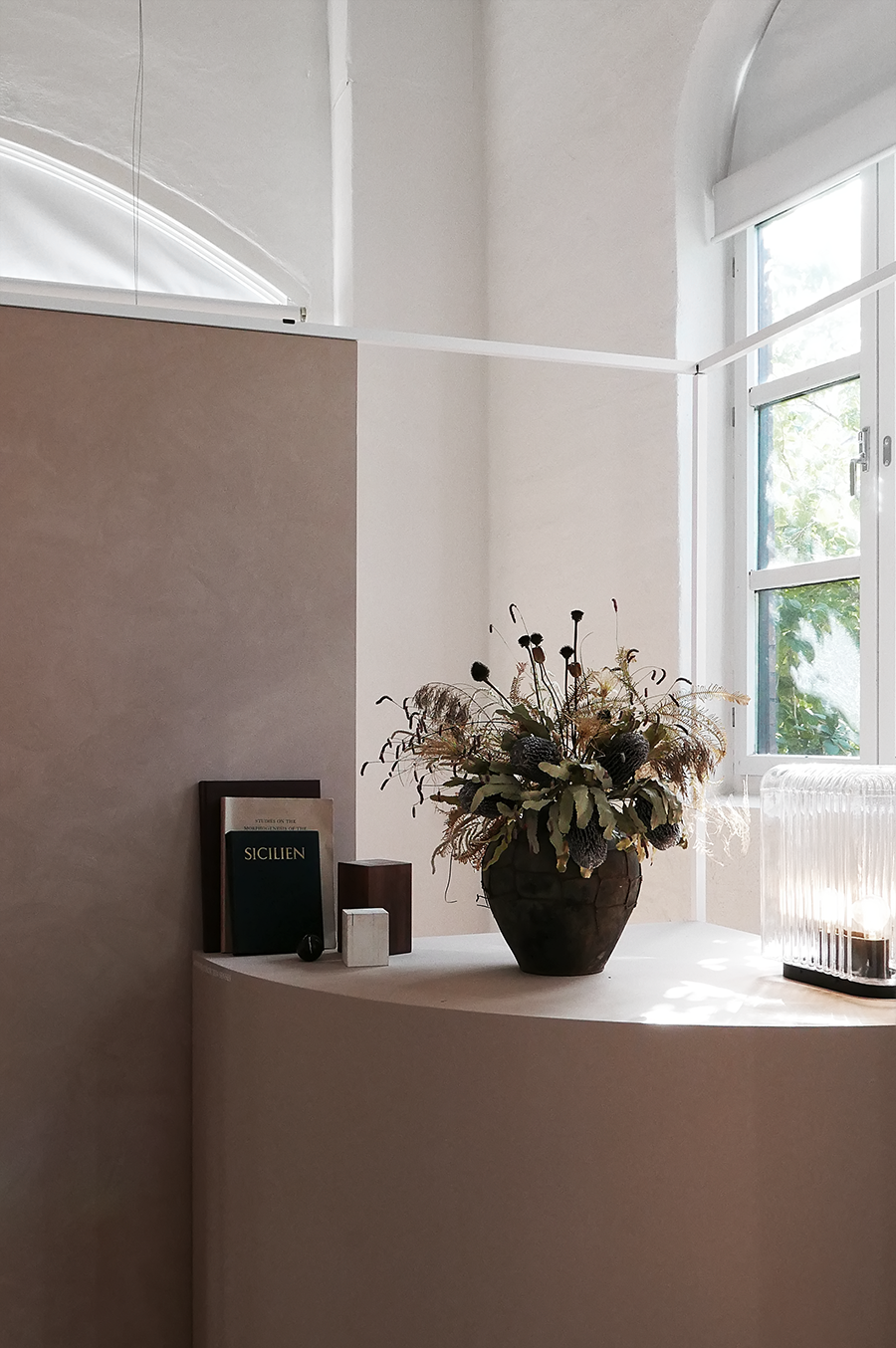
Wall LADY Pure Color 12080 Soft Radiance
Wall LADY Pure Color 20120 Organic Red, skirting board LADY Supreme Finish Matt 20120 Organic red
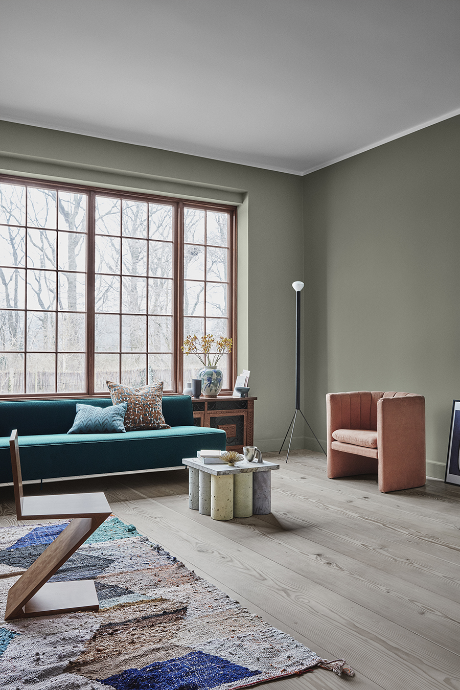
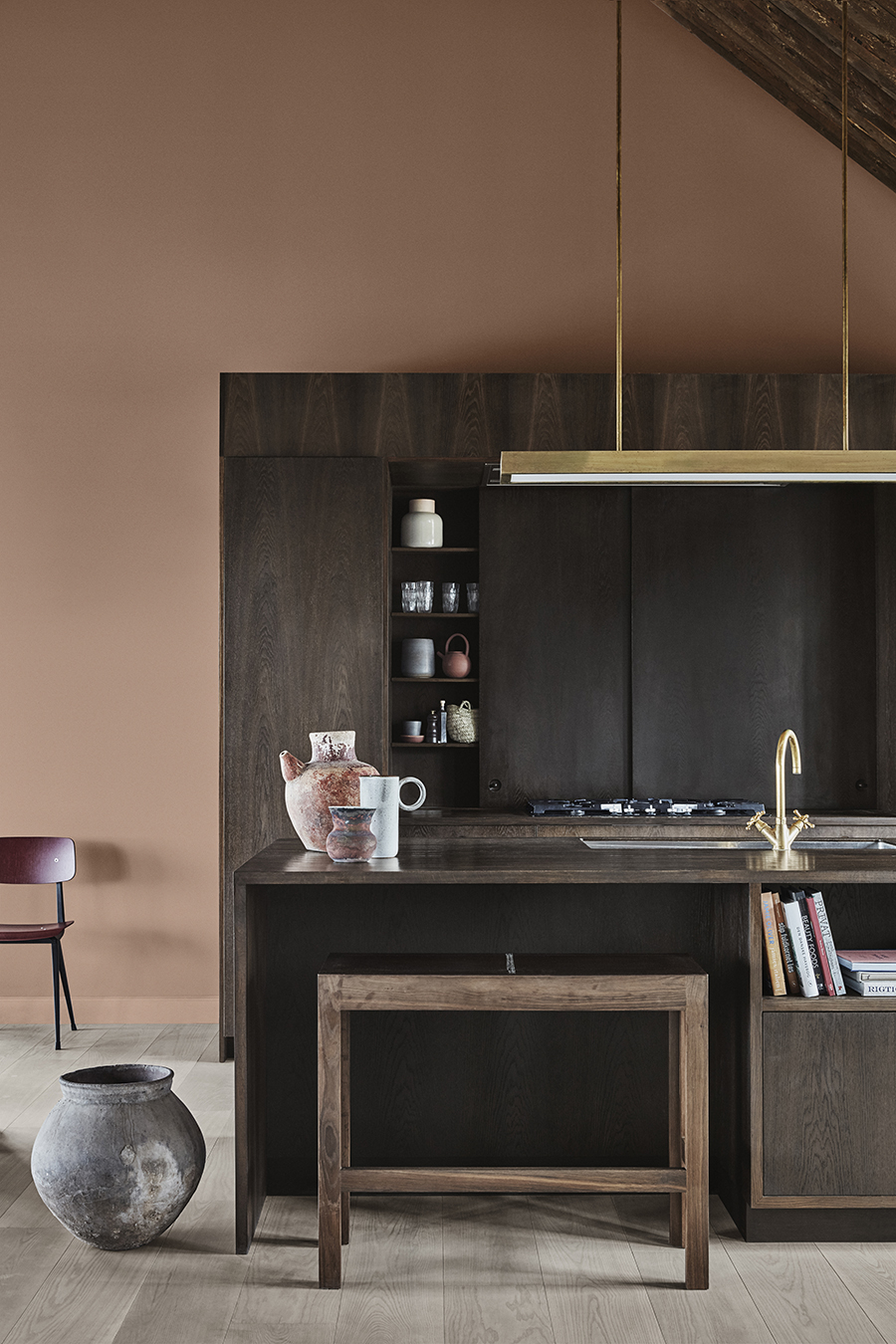
RAW
The third theme consist of deep earthy reds, sensuous peaches, greens and darker neutrals. The raw identity is rooted in the earth. Their home is that of a maker and an artisan – an individual that relishes the honesty of working with their hands, who values provenance above polish. They are chefs, and hunters, bakers and carpenters. They find beauty in craft and utility – reflected in rustic homes and grounded spaces full of natural, wood-and-stone textures and the colours of soil and sand.
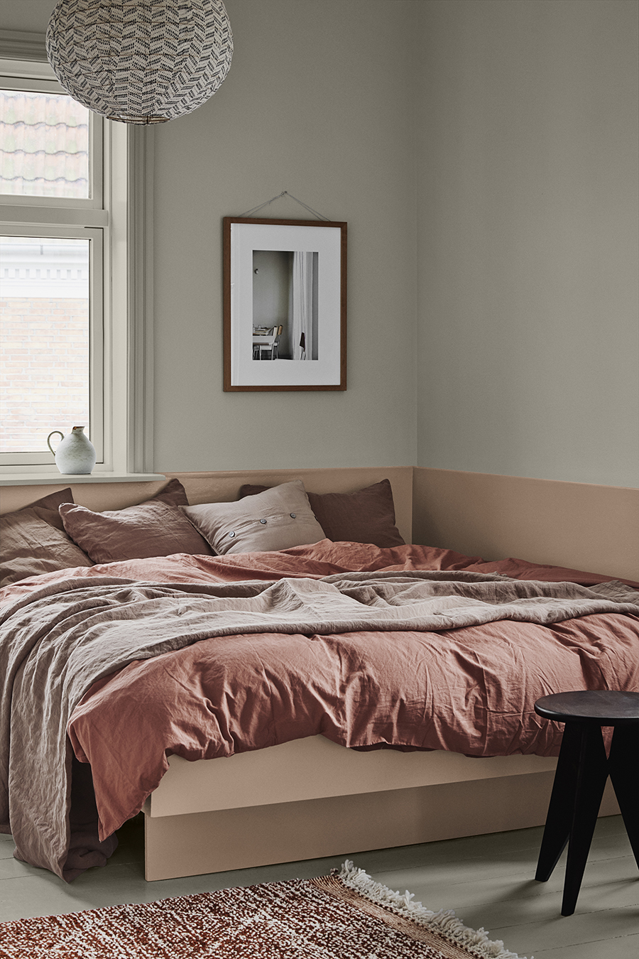
Wall LADY Pure Color 12078 Comfort Grey, lower part of wall LADY Pure Color 2014 Sense, bed frame LADY Supreme Finish 2024 Senses
The three identities created by Jotun are in no way prescriptive. Users of the colour card are free to mix and match the new colours as they wish. After all, the rooms of a home can each reflect different facets of an identity – someone may be a hunter in the kitchen or a curator in the living room, but seek a moment of Zen in the bedroom – or be a combination of all three types. The colour card gives us the freedom and flexibility to reflect ourselves as we are, to show our identity in our homes.
Elisabeth
The post appeared first on .


