I asked over Instagram if there were any blog posts you fancied seeing and I had a few questions about how to style a gallery wall,which I have to say can totally mess with your head…agreed! I’ve created various gallery walls in all of our flats so far and learnt what seems to work and what doesn’t so I’ve put together my tips for how to approach it as well as some examples of layouts to help you make your space work.
Pick your space
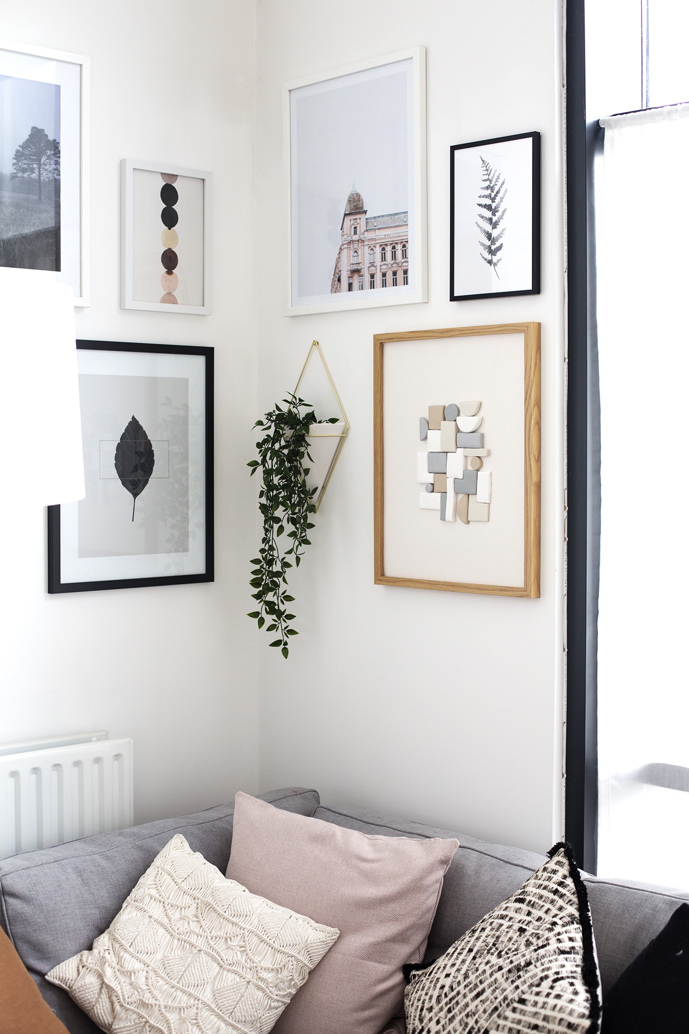
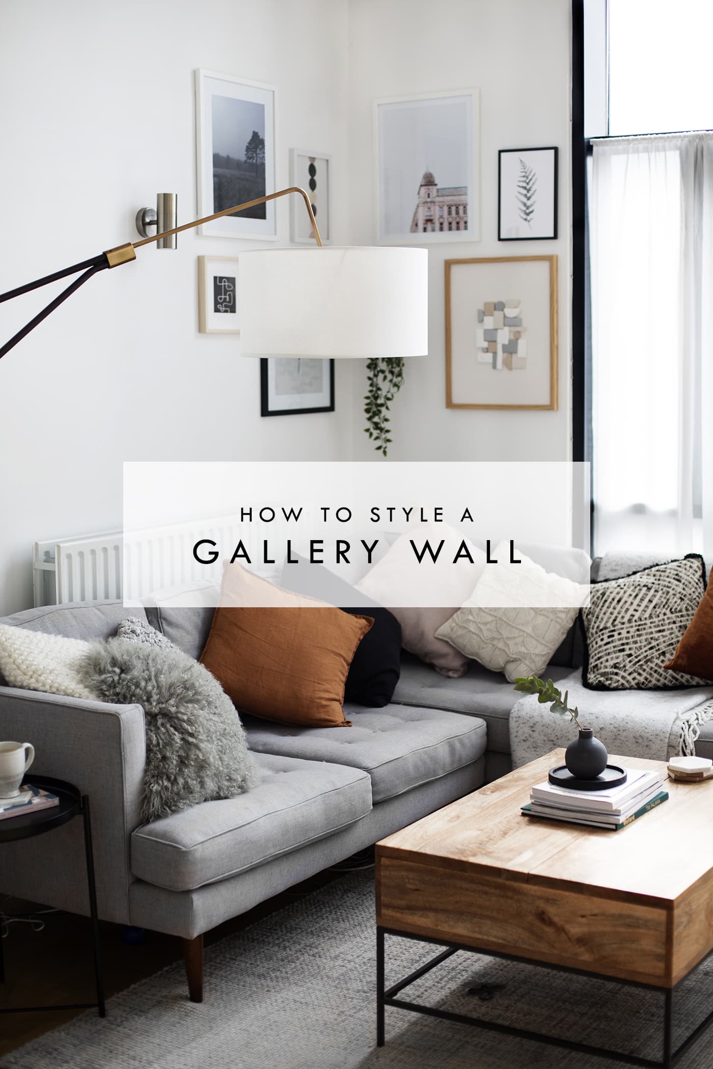
A gallery wall is usually a great way to fill an empty and somewhat neglected space or to make a feature of an area for instance above a bed or in a hallway entrance, to greet people. I would suggest the space be big enough to hold a little gallery with some breathing space on either side as well as above and below. It looks really forced when a collection of prints appears squashed into an area. It doesn’t always need to be a flat wall as I’m quite enjoying my gallery in the corner of my living room. Somehow it makes that area look much more cosy.
Mix up your frames
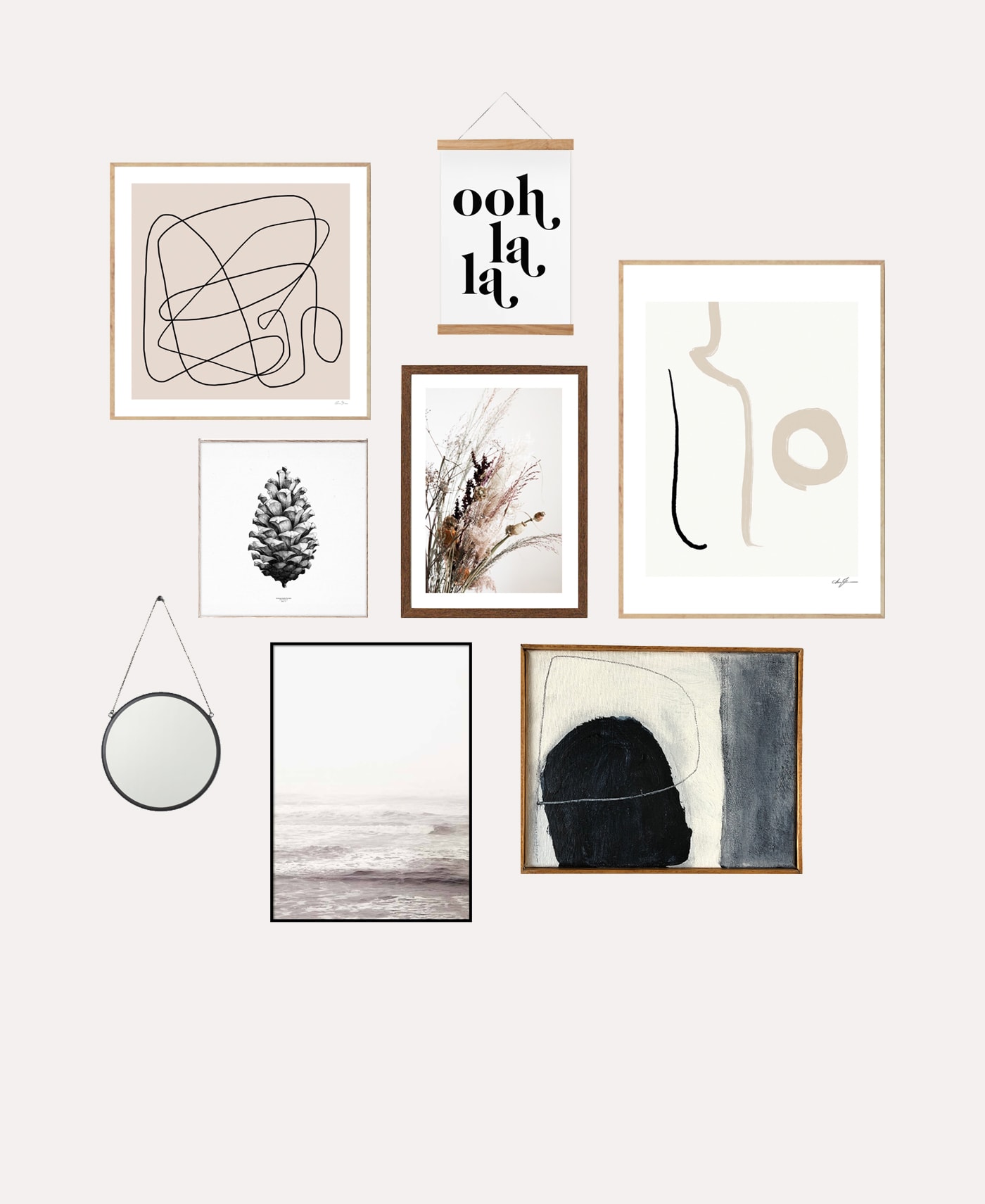
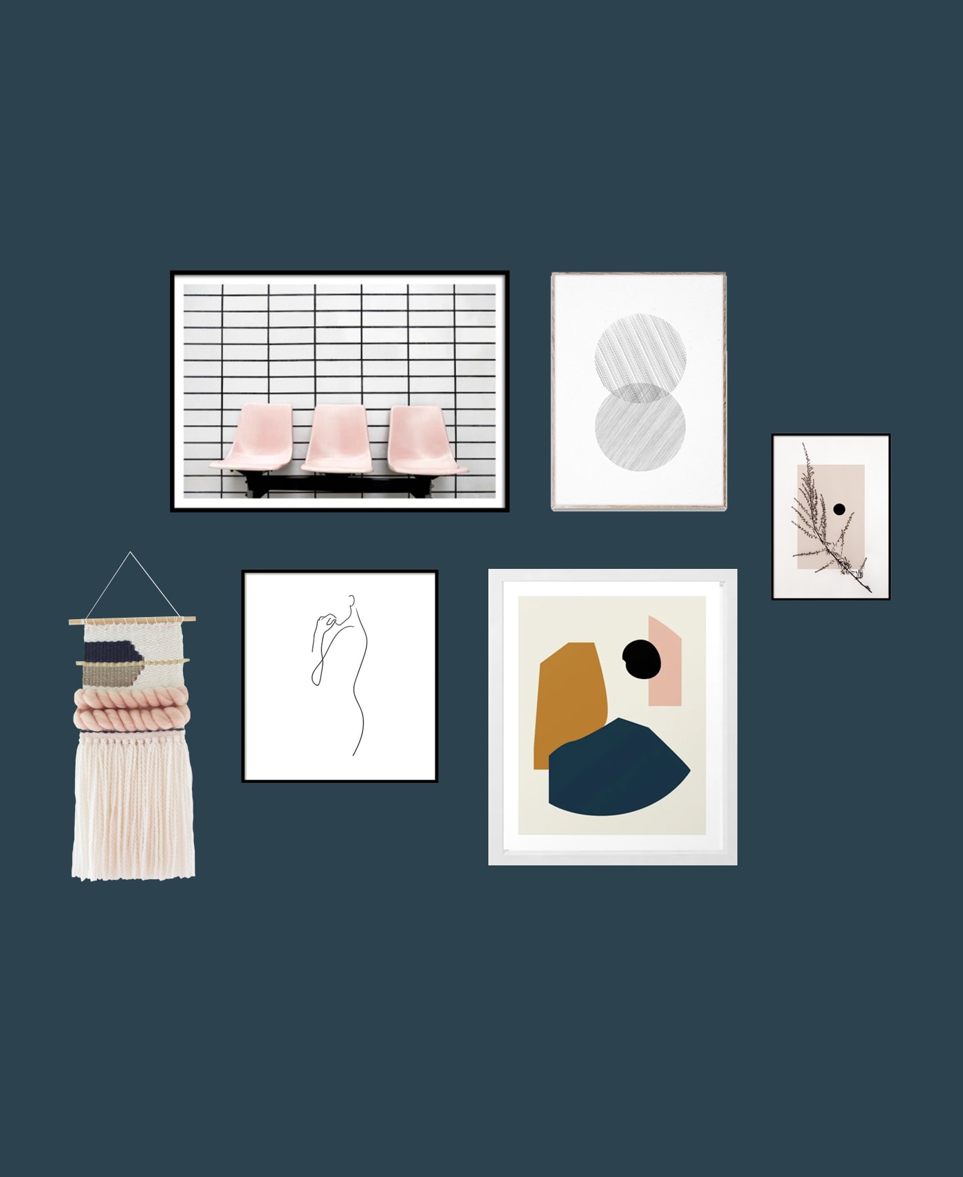
I would start by roughly plotting the formation of your gallery. Think about using different frame sizes, some portrait, some landscape maybe some square rather than having everything overly symmetrical which can look a bit too tidy and lacking personality. Think of it like fitting together a puzzle. Sketch out the layout first or you could even create a mock up on photoshop if you have it. That way it feels less of a blind commitment and hopefully you’ll be filled with less terror (no?…just me). I’ve provided some examples below for a healthy dose of layout inspiration. I find it’s more interesting to have a mix of frame colours/woods too. Be mindful of the wall colour so the frames don’t camouflage into the surroundings. Contrast is a good thing! You can even ditch the nails and buy some picture ledges to display your gallery. Prints look lovely just propped up against a wall, slightly over lapping one another and it means it’s even easier to swap things around. Less commitment!
Picking your prints
This is the fun bit but also the part I agonise over for days! My approach is to have a mix of styles and accent colours. I think the gallery wall has much more life when there’s a mix of photography, typography and illustration. Often having a similar colour palette running through is enough to tie them all together. Pick a mix of white/ plain backgrounds and images that are bled right to the edge so it doesn’t look too full on. If you have gaps in your wall that you’re not sure how to fill then I find abstract art prints work really well! Shapes or lines or even just blocks of colour compliment a vast array of prints in a gallery set up. My advice is don’t go too trend led when choosing your prints as this won’t have longevity, although the good thing about a gallery wall is you can sub prints out as time goes on and you get bored.
If you’re stuck as to where to find some lovely wall art then some of my favourite places are , , Etsy, , and . Of course I also sell so there’s a little shameless plug there!
Leave Space For Detail
Your gallery wall doesn’t need to be made up entirely of frames, in fact other details interspersed between the prints makes the whole thing look more complete. By this I mean add hanging wall plants, mirrors, wall hangings or garlands. Think of it like adding a bag, earrings or shoes to an outfit. Have fun with accessorising the gallery but do remember to leave space for these things. Ideally they should be planned into the overall layout, unless you’re using picture ledges.
 | | | | | | |
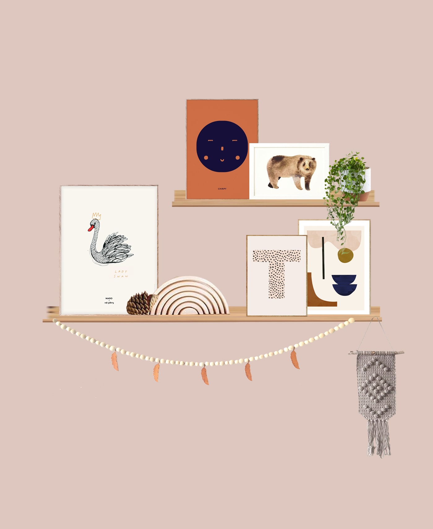
I kept this one very neutral but instead played with tone to create depth, as well as adding in warmer toned pieces as purely monochrome looks can be a bit cold. The picture hanger breaks up all the frames and the mirror is also a nice addition as it throws a different shape into the mix.
 | | woven wall hanging | | abstract print |
With a strong wall colour like this one it’s a good idea to pick prints with more negative space i.e more white or cream to contrast. I picked up the muted pink colour in a few of the pieces and the weave adds some much needed texture.
 | | | | | monogram print | wooden garland | | wall hanging
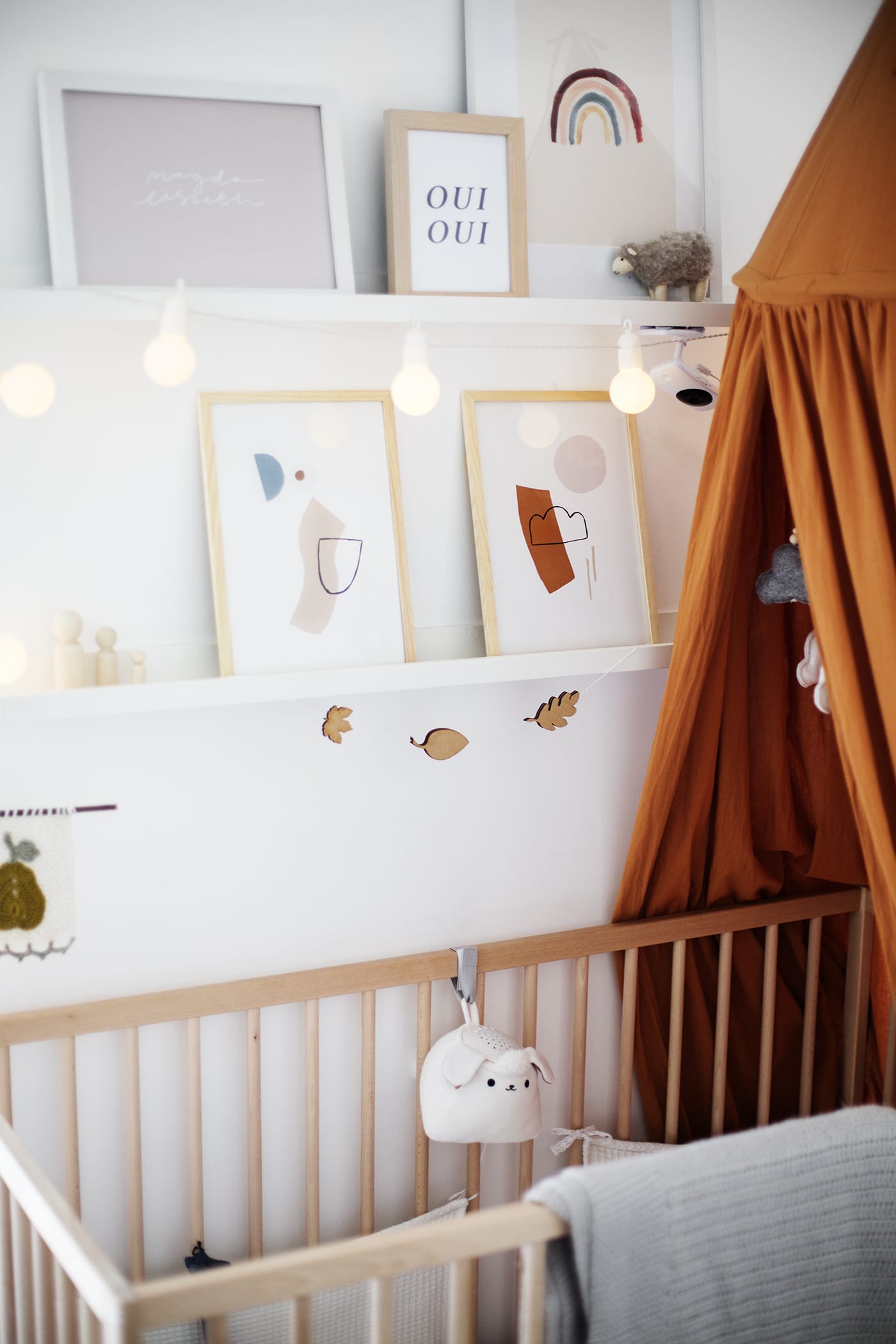
Picture ledges aren’t exclusively for nurseries but I do happen to think it’s a room that really does suit them! Here I’ve layered the pictures which are a mix of mix of naïve illustrations and block shapes. I had fun adding details to this one to make the overlook much more personal.
The post appeared first on .


