Those who follow me for some time will know I work a lot with . I used their paint on most of the walls in my home and I am always happy to share their colour updates. The soft almost velvet feeling and different grey-beige tones is something I really like. I always get lots of DM’s whenever posting an image of one of my walls on Instagram asking me what colours I used.
Recently I watched the online launch of two new color cards by Little Greene to meet the growing demand for classic, timeless colours, which are both easy to choose and pleasant to the touch: the updated and refined ‘Colours of England’ colour collection and an extensive range of graduated shades in the new ‘Colour Scales’ range. The colour cards have been given a new format and are presented together in one package. Really handy for someone like me who has a box full of colour cards.
The updated palette of 196 Little Greene shades brings together the best of all previous capsule collections and is designed to make choosing paint colors enjoyable and intuitive. Think of 300 years of historic interior design, and authentic shades from the 18th, 19th and 20th centuries. These historic colors are presented together with a carefully adapted palette of contemporary shades, embracing the aesthetics of modern interior design and current decorating trends. Read on to learn more about the latest trends in colour explained by the paintmakers themselves.
Color Scales
The comprehensive Colour Scales map includes eight families of progressively ranked iconic Little Greene colours, as well as the Stone and Gray capsule collections.
In addition to the ever-popular neutral tones, the map also includes deeper colours, which identify the undertones of each colour family. Each shade belongs to a graduated colour family and is grouped in a column based on undertone. So each colour family has its own column. The tonal hues within the same column can be harmoniously combined or a balanced contrast can be created by combining colors from different columns.
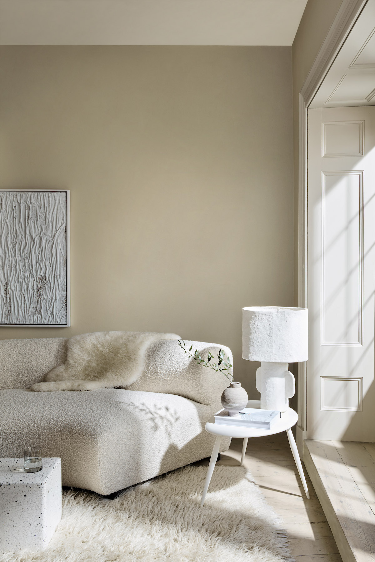
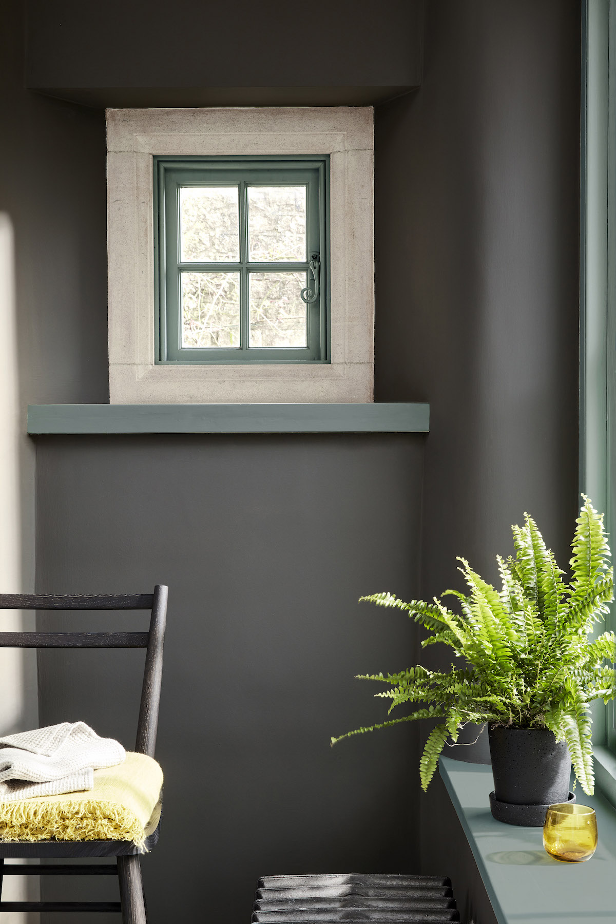
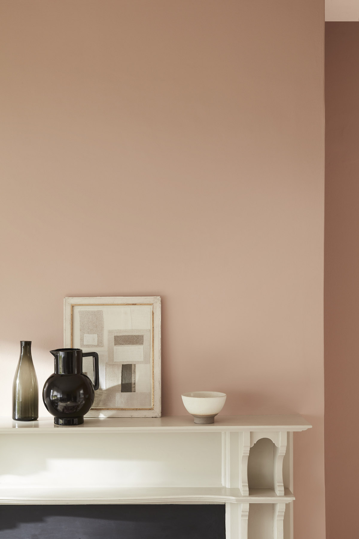
Ruth Mottershead further explains: “The neutral trend for 2021 is subtly evolving from cold grays and the traditional country cream tones to neutral stone tones, complex grays and nature’s favourite: greens.
By categorizing these soft tonal colors into the respective color families in the Color Scales, we can offer a subtle, spectral color range that allows customers to confidently create combinations. The four lightest shades of a color family can add beautiful, discreet depth to a room and accentuate architectural features in a soft, atmospheric way. Also, combining these shades can reduce the contrast between walls and ceilings if there are different light levels. The deeper shades can be applied to complete a coordinated, harmonious color scheme. With this, an extensive color depth makes a striking statement, despite the monochrome hue.” txt Little Greene
Colours of England – From yellow to pink
The new ‘Colours of England’ color chart has been updated to meet the growing demand for classic, timeless colours, which are both easy to choose and pleasant to the touch. The collection includes many meaningful shades from all over the UK that have contributed to the internationally renowned English Interior Design style.
Marketing Director Ruth Mottershead : “In addition to Little Greene’s much-loved, signature colour palette, it’s great to introduce new colours that represent the need for warmth and cheer, such as ‘Indian Yellow’. This colour takes its name from the traditional oil pigment, which was used by visual artists. Or the colour ‘Bassoon’, with its deep ocher undertone, and the color ‘Giallo’, which offers an uncompromising yet very user-friendly color explosion of golden sunlight.
These bold and elegant yellows illustrate our desire to return to warm colours, but without resorting to creams. These new punchy yellows are joined by a host of other new colours, including the soft powdery pink ‘Masquerade’, the rich and charismatic charcoal gray ‘Vulcan’, the beautiful and inviting semi-strong blue ‘Etruria’ and ‘Silent White’. This last color is the solution for the eternal search for the perfectly balanced, soothing and elegant neutral-warm white.”
Forty of the most popular shades are included in both color charts, giving customers the opportunity to see these exceptional shades in a variety of color environments. This makes it clear how these shades work in a coordinating and harmonious, or in a dynamic and diverse, way. txt Little Greene
Het bericht verscheen eerst op .


